We have this unbelievable artisan bread maker here. I don't eat any commercial bread at all, because it's all so gross and processed. So when my sister told me about this amazing man who offers bread subscriptions for full or half loaves of this unbelievable handmade bread, I tried it.
My life was changed forever. I've never had anything like this bread. Here's a description of one of his breads. He has a calling.
This week I'm making a loaf with einkorn, one of the first plants to be domesticated from its wild form 10,000 years ago in southern Turkey. Hunter gatherers harvested wild einkorn 30,000 years ago! Einkorn has a higher protein content than most modern wheat, and is also rich in beta-carotene which gives it a beautiful warm color.
His crusty, chewy outside with the pillowy, air pocketed inside is a work of art.
So today, I called my sister to remind her that it was bread pickup day (we always forget) and she told me that she was reading this book, which is about the microbes that are on and around us all day every day, and how they protect us from bad microbes if we let them. They did an experiment where they gave a bunch of breadmakers all around the world the exact same ingredients and process, even water, and had them make bread. And they all came out different. The individual microbes in a chef's personal biome influence the final product in a significant way. Fascinating.
There's always more going on than meets the eye in all things. Any type of art for sure. That's why copying has its place while you learn, but it will never be truly yours without your own, unique mark.
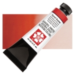
So I made a card about uniqueness. I used this background stamp (why do people keep making floral sets I have to have??) to make my point. I finally got my hands on the newly released Daniel Smith colors - all but one are greys, and the new Alvaro's Fresco Grey - BE STILL MY HEARTTTTT! I love it so, so much. I know this sounds weird, but it's almost like a sunkissed Payne's grey. Blue forward but a hint of warmth in it. I watched it separate on my palette and I saw my friend Ultramarine coming out. The warmth comes from Ultramarine Violet in it, another color I love, (or pigment if you're feeling stuffy today). The slightest hint of white in it - like it was brushed with an angel wing, makes it glow a bit. Who knew grey could be so interesting?
Daniel Smith, that's who. And Alvaro Castagnet. And Jane Blundell. And Joseph Zbukvic, apparently.
ANYWAY - I thought it deserved a large canvas, so I stamped it in Fadeout Ink on cold press watercolor paper, and I painted everything but the focal image in shades of this stunning watercolor. The red flower has a touch of it as well, for harmony, but is otherwise Pyrrol Scarlet.
I used the Cut-Align to cut a sentiment strip with the sentiment from this set for the front in Nocturne. Didn't want anything too big covering up those flowers.
That gorgeous set is new tonight - and you can see it and all its friends here.
I had to indulge my inner teacher too though. This little alphabet die comes all in one piece to be cut apart - but I didn't want to. I thought it would make a super fun background die cut for a teacher appreciation card, so I left them together and cut it all out of a Gel Press print. Then I took the little pieces like the inside of the o, the a etc. and glued them back down onto the white cardstock to fill in the letters. If you stare at it long enough it looks like the letters are on top of the print, but they're not - they're holes in the print.
I finished it off with this sentiment in Nocturne, and used the three little hearts from these dies to add a few little hearts to match the sentiment from this teacher set.
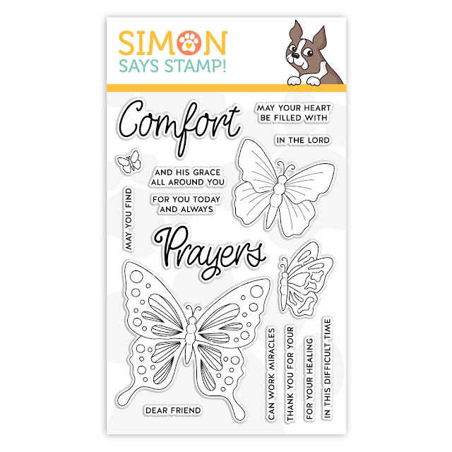
I have a video coming up with this butterfly stamp set - and the video has a special plot twist, so if you want to be ready to use my technique, grab this one if you're in a shopping mood. You will love it, and love my twisted video :). Soon, I promise.
Loveyeameanitbye.

|












Your mind... visually, culinarily, linguistically... Seriously. (These glimpses into the way you are in the world make one of my happy places in life.) Thanks for being you.
ReplyDeleteThat floral watercolor painting... that grey, touched by an angel’s wing... I am in love.
ReplyDeleteThat floral painting is just stunning
ReplyDeleteAbsolutely beautiful, and yes, I had to run right out and buy it because it is beautiful and the way you described it, I knew I needed it. Needed, not wanted!
ReplyDeleteAbsolutely stunning!!! Love this color combo and your no-line watercoloring is always soooo amazing!!! 😻😻😻😽💞💞💞
ReplyDeleteI almost cried at your description of the watercolor and then chuckled at the "stuffy" comment! (I am very emotional today for no apparent reason). Seriously though, I get so excited about art and I see the people around me going glassy eyed or smiling at me like "you are just so cute" when I describe something that excites me. So when I read your description of the beautiful watercolor it made me get teary-eyed at your love for color! Not feeling stuffy today. :)
ReplyDeleteThat floral card is GORGEOUS! GORGEOUS! Please make me 45 of them. I'll PM you my mailing address. Thanks! ♥
ReplyDeleteLydia, I can't stop looking at the flower card you did. So many shades of one color! It's amazing. And the bright red rose in the middle makes it a show-stopper in my book. Please, please do a video on how you managed to get all those colors from one paint!
ReplyDeleteThanks Lydia!