Sunday, February 28, 2016

Please Use Other Door

I met my sister and her husband at a French bakery we like the other day. They brought their new Great Pyrenees puppy - Duke - along, so he needed to stretch his legs after breakfast, so we just walked him down the shopping center.

I noticed a few things about the doors in this newish center.

First, there was a pediatric clinic that had two separate entrances - a sick entrance and a well entrance. What a great idea to keep those apart! It's not like kids need any extra help in the germ department.

But on every business entrance in the shopping center, there were two doors. 100% of them had signs on one door that said "Please use other door."

The forbidden doors were all locked, while the chosen doors were all open.

So my question is - why even have two doors? For some reason, all business hate one black sheep door and love the other one.

It can't be fire code to have two doors that open, because EVERYONE locks the black sheep door.

It just seems like such a waste to pay for a door that you hate and never use.

I vote for single doors, so that all doors can get the love and respect they deserve.

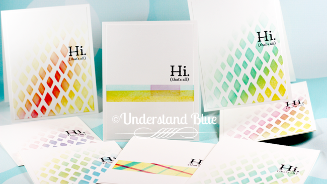
This weekend I finally got a chance to play with my Clarity Stamp Stencil brushes.

I had seen these at CHA but only ordered them recently and was anxious to try them because I'd heard how amazing they were and I couldn't believe something as simple as a brush could make people shriek and carry on.

But holy cow did I shriek and carry on when I tried them.

They.
Are.
Amazing.

They are incredibly soft, and you swipe them from side to side (imagine not rubbing a cat's fur the wrong way - you want the bristles to not get rubbed the wrong way either) on your ink pad and then your stencil, and they perfectly lay down and blend ink, with no marks or textures like sponges and sponge daubers can leave.

Zowie. I'm in love.

Because they have been such a crazy sensation, they can be a bit hard to find in the US, but I know Simon Say Stamp has them here.

I did a bunch of simple cards with the Happy Patterns Stencil pack, the ADORABLE new Sale-A-Bration set Party Pants, and some 3M Post-It tape for the one in the center - that was actually my test card for the first time I tried them. I only used three ink colors for all these - Daffodil Delight, Tempting Turquoise and Melon Mambo - or as I call them, the Holy Trinity of inks.


Stencil Brushes & the Mini MISTI by Understandblue

Pin It

I especially love the soft fade you can do with these brushes. In order to do  that with sponges, you have to work hard at having a very light touch. I did a card similar to this at my last retreat, and I had to really let everyone practice a few times to make sure they were getting most of the ink off the sponge before even beginning. These brushes hold ink in a very different way and so that is not an issue.

And they play very nicely with firm foam ink pads.

So I made a quick video of using these to make three of these cards in four minutes with the brushes, the stencils and the Mini MISTI, so take a peek! PS - even though that sentiment is one word, you definitely need the MISTI to test it and line it up properly - it was kind of a booger to line up. I might never take it out of my MISTI now that it's straight. I'll just buy another MISTI.


So next time you go into an establishment that has shunned one of its doors, try to show that door some kindness.

It's been the black sheep since it was installed.

#alldoorsmatter

Loveyameanitbye.


Wednesday, February 24, 2016

Big Magic

I read a book recently that I think everyone needs to read. It's called Big Magic.

One of my team members recommended it to me - she's like my book sherpa - and her name is Sarah. You should follow her on her blog and Instagram because she's amazing - smart, funny, energetic, and has superhuman strengths.

But her real calling is as my book sherpa.

The part of this book that really struck me is the part about being receptive to ideas.

The author says that ideas are swirling around out there in the universe, and they end up with people who are in the right frame of mind to act on them.

I definitely believe that this is true - I've seen it in action. My friend Luressa, for example, came up with the idea for something called Tattle Teen - a LONG time ago. Basically it was a bumper sticker with a number where people could report other people's teenagers for driving badly, etc.

This idea then visited other people, who turned it into apps and devices on cars that report speed, stop times, etc. to parents right from the car.

These people all independently hatched these ideas, but some of them were readier than others to turn the ideas into reality.

I think we've all been on one end of this or the other, and it's really magical to watch it all happen.

In 2008, I saw this card by Ellen Hutson and I was SO inspired by the idea of just adding white pencil to stamped images that I created THIS hideously boring card.  Sorry Ellen!

But just recently, I've been seeing the most SPECTACULARLY beautiful cards using white pencil by Chris Dayton that I had to give it a try again.

Great ideas never die, and they are better every time someone tries them.

Her work is just stunning. She has a very wide range and a lot of talents, but those white pencil cards really spoke to me.

I knew the perfect image to try this out on - the Birthday Blooms floral image.

I stamped the image in Whisper White craft ink, and then colored it with both a White and a Greyish Black Caran D'ache Pablo Pencil. This is where you can find my smudge guard.


Pin It

It's so super duper easy to get a pretty look with just one or two pencils.

I made a quick video so you can believe me on how easy it is. I stamped it in my Mini MISTI (PS - I think these are available now - squee!) because I toyed with the idea of adding heat embossing to the image after I was done coloring it but then I changed my mind.


So is there an idea floating around that is just waiting for you to bring it to life?

Spend some time thinking about that - it might be your time! :) And most definitely read (or listen to - that's what I did) the book.

Also, check out today's ADORABLE tutorial for a paper bag gift card by my beloved friend Bev, for today's Splitcoaststampers Weekly Inkling newsletter - it will steal your heart. 

Loveyameanitbye.


Tuesday, February 23, 2016

Three Hours From Everywhere

My neighbors and I have a little ladies brunch we've started doing once a month, and the February one was yesterday.

It's fun and relaxing, and we get to try everyone's yummy favorite recipes, gossip a little, see our neighbor's homes, complain about our ugly builder bathrooms - just do neighbor stuff.

Today we were talking about Texas geography and how baffling the size of the state can be to Europeans and Yankees.

I remember when I lived in New York, and people would ask me how far I was from Dallas or Houston, and I'd answer "three hours", and they'd stare at me like I had two heads.

"But how FAR is it?" they'd ask - louder, this time, in case I was hard of hearing.

"THREE HOURS" I'd yell back at those idiots, which would bring about a standoff.

"What don't they understand?" I was thinking... "Why doesn't she understand?" they were thinking...

If I tell you it's thirty billion miles across the state you'll just cry and never leave your house. And while I understand that you can drive across 14 states in three hours in New England, you are barely leaving your county of residence in that time in Texas. So you need to know a few things - how long until I have to stop to pee? Can I get there in a day or less? I know how many hours a tank of gas lasts, so is the destination less than one tank of gas away?

But today we realized that Austin, in particular is three hours from EVERYWHERE.

It's three hours to Dallas and three hours to Houston.

It's three hours on a plane to Florida, New York, Washington and California.

We're just at this crazy nexus of the US travel universe. We're also nearly in the dead center of the Great Republic.

You can really learn a lot of things at a neighbors brunch - I highly recommend it!

Here's the card I made on Periscope the other day using the Mirror Image Stamp again to create a reflection in the water, as I did in this post.

This sweet stamp set is called Happy Home, and I'll be having a class with it in March, so if you're in Austin, let me know if you'd like to come!


Pin It

I love that sweet little dog - or wait - is it a CAT?? Yes, it's clearly a cat.

Who doesn't want to fly their kite with their cat?

Definitely a cat.

I just sponged Tempting Turquoise and Pear Pizzazz  after the mirror image stamping, and then used a blender pen and Real Red ink for the girl, the kite and the grass. I also extended the horizon line with a Project Life Pen.

The sentiment is from Cottage Greetings - which I think is truly the best sentiment set in the catalog - I love the clean lines.

Another thing I love about the way these stamps are cut, is that the cut lines on the rubber are straight, so I can line them up against the edge of the rails in my MISTI and they are straight every time.

With such thin lines, greetings like this can get distorted with too much pressure, but the MISTI helps keep people from smashing the stamps like there's a spider underneath them, because you can't push the lid past the rails. It really is a huge enhancement for delicate lines like these - I love it. How did I stamp without it? Badly - I know. :)

Hope your week is starting strong. If not, I highly recommend making yourself some of these delicious orange muffins from our neighbor ladies' brunch. I LOVED these - they're very light and not too sweet.

Ingredients

1 3/4 cups all­ purpose flour
2/3 cup sugar
1 tablespoon baking powder
1/2 teaspoon salt
1/2 cup (1 stick) unsalted butter, melted
1 cup sour cream
1 large egg
1/4 cup freshly squeezed orange juice
Zest of 1 orange

For the Zesty Orange Glaze

1 1/2 cups confectioners’ sugar
1/4 cup freshly squeezed orange juice
2 teaspoons orange zest
Instructions

Preheat oven to 400 degrees F. Line a 12­cup standard muffin tin with paper liners; set aside. In a large bowl, combine flour, sugar, baking powder and salt. In a large glass measuring cup or another bowl, whisk together butter, sour cream, egg, orange juice and orange zest. Pour mixture over dry ingredients and stir using a rubber spatula just until moist. Scoop the batter evenly into the muffin tray. Place into oven and bake for 16 ­- 18 minutes, or until a tester inserted in the center comes out clean.

To make the glaze, combine confectioners’ sugar, orange juice and orange zest. Whisk until smooth. If the glaze is too thin, add more confectioners’ sugar as needed. When the muffins are done, cool for 10 minutes and dip the muffin crown into the glaze.

Allow glaze to set before serving.

Loveyameanitbye.

Sunday, February 21, 2016

#IMBRINGINGBIRTHDAYSBACK (too)

So by now you've probably all seen Shannon West's awesome campaign to take back birthdays from Facebook.

She said that the ubiquitous Facebook "happy birthday" message has depersonalized birthday greetings, and that our birthdays deserve the PROPER celebration of a handmade card in the mail.

She's right.

She's so right that they interviewed her on television about it, and she has more than 1200 names and counting in her database - and she's sending handmade cards to all of them!

Lots of people have hopped on board, and I just think it's fantastic. Long live snail mail!

However, in general, mailing birthday cards is something I really stink at, because - wait for it - I am not a planner person.

I will pause while you all cry dramatically and tear at your clothing and try to convince me that I should be.

You done?

I'm sorry - it just doesn't work for me. Because of the nature of my work, which is almost exclusively online, I do not have a schedule that fits into a calendar format. It's more project and yes, crisis, driven, and so truly a simple list works much better for me. That's all I ever have on my desk.

In order to send cards to people, I need something in a list format. I talked about how I keep track of cards that I need to send for thank yous, sympathy etc. in this post, but those are different because they are not predictable.

For birthdays I need the list in front of me throughout the month.

So I pondered exactly what I needed, based on a few things that I considered necessary:

  • Small footprint - I have a very small desk
  • Blue - duh
  • Flippable, so it's easy to move from month to month
  • Easy to change out so that as I add birthdays I don't have to re-do the entire calendar
  • A timeless, perpetual format that isn't dependent on a year
  • Sort of minimalist - you really don't need much info to be able to send out a birthday card - just a date and a name - I keep everyone's addresses in Google Contacts, so I don't need that info on my calendar. I have a "birthdays" group in Google Contacts and I just print address labels at the beginning of the year for everyone in that group, and then I can keep them with my calendar. 
Flippable was the challenge. I searched long and hard for the keywords to use to get what I found, and I was so excited when I finally found EXACTLY what I was looking for.

A blue, flippable pocket-based system that was originally designed to showcase Instax photos. I love it! Here's a link to the frame.  How cute is that??? Here's the side view of the calendar.


Now I set this up so that I had to do a minimal amount of work to bring it all together, because I'm all about sending the cards, not engineering a calendar.

I created the template so that it would fit Avery 5390 perforated name badge inserts, because I measured the pockets and those worked perfectly, and I figured that was a quick way to get them done. You can also use cardstock or DSP.  

Then I sized the circles on the templates so they would fit these clear SRM date stickers - I liked these because you get 12 of each number per package. Just some random trivia - the most common date in my group of birthday peeps is the 15th - I used 7 of these in this calendar. Apparently I don't know anyone who was born on the 16th, the 20th or the 23rd though. (Although I'm quite certain I will after this blog post.)

This is one of the great things about this calendar though - the efficiency of not having to have any dates that there are no birthdays on. That's is another drawback of a traditional calendar for me - wasted space. This thing does one thing and it does it really well - birthdays.

Finally, I used these labels to print my names out  - they're long enough for longer names, and for shorter names I just wrapped the extra around the back of the card. They also come in clear, in case you want to print the template on DSP or something you've watercolored, etc.

I just wanted clean white, so this is what mine looks like.


Pin It

This is SO much easier for me to see quickly what cards to send and when.

Now I'm 100% on board with #imbringingbirthdaysback - I'm committed!

I do have this template available for purchase if you want to print your own. I have the file set up so that it prints 3 cards for each month, along with some extras of the statistically most common birthday months at the end.

If you want to print on another medium and not the badge inserts, I've also included cutting instructions for you at the end. You can purchase the template here.


Here are the supplies I used for the calendar.

So my very first card went out today with the hashtag on the envelope.

I ordered a custom one from Bossy Joscie, and I'm not alone - she says she's had a lot of custom requests for them so now she's selling them as well. I ordered some of the ones she does with the social media icons on them too - I love these! Great way to easily show people how to find you.

So how about an actual birthday card after all that preparation for the year of birthdays?


This card was just an accident, but then I ended up liking it. I was testing a little tool I built to flatten out warped watercolor paper, so I just put random very wet paint down. One ended up looking JUST like a bird - according to my Facebook friends - a painted bunting, and this one ended up looking like an abstract landscape so I decided to keep it and turn it into a birthday card.

I love that teeny sentiment from Sunburst Sayings - It's so clean and small. And it doesn't have to be birthday either.

I'm listening to this book right now, and it's really good. I am thinking about trying this recipe, which I saw on Facebook. And I took this photo of this amaryllis my friend Chriss gave me for Christmas - it's crazy because it has this cluster of four huge blooms on it. Looks pretty with my chile peppers hanging nearby.


Hope you got a little you time this weekend!

Loveyameanitbye.

Saturday, February 20, 2016

Rediscovering HoJo

When I was little, during one of our drive-cations, my family made an ill-fated stop at a Howard Johnson's. I've alluded to this story before but never told it, and its time has come.

Most of the really outrageous stories worth retelling in our family revolve around either food or a spectacularly awful hotel. Sometimes, unfortunately, both. This, by the way, is why I'm a bit of a travel princess now, in case you thought that attribute was somehow my fault.

It is not.

The problem begins with my dad's digestive system.

It is made of some unusual material which makes him 100% immune to food-borne illnesses. It should be studied, because I believe an E. Coli. vaccine could be developed that would change life on this planet.

M. Night Shyamalan, could write a dark superhero epic about the man who could not be felled by food.

No matter what dark drive-in we stopped at on our journeys, where both the building and the employees (there never were any other customers of course - they were already long dead) looked like the inside of a Stephen King novel, no matter how old the food, or how dirty the restaurant was, my dad was the only one of us who didn't spend the next three days barfing.

The maddening result of this, of course, was positive reinforcement for him, and so he continued to choose poorly on a regular basis, happy as a little lark, getting the remote control all to himself while everyone else was lying on the floor of a bathroom in a hotel in Arkansas.

So one day, we go to a HoJo. I do not remember what god-forsaken town we were in, which you will soon understand.

HoJo was, back in the day, sort of the McDonald's of road warrior restaurants. You could generally rely on their consistency and kid-friendly menu. They had something called an orange freeze, which my brother and I LOVED - it was an orange sherbet milkshake of sorts. I think it even had a little lime sherbet in it too. It was delightful. They sold taffy too. All the food groups a child needs.

For the most part, we lived through eating their food until this fateful day. On this day, I ordered spaghetti and it was quite decidedly OFF. So I stopped eating it. I got yelled at and told I had to eat it, which should really be against the law, or considered terrorism. I was so miserable and it was so awful that my sister finally took pity on me and tasted it.

All the blood left her face as she informed my parents that there was definitely something wrong with that spaghetti, at which point they of course felt bad for making me shovel it in. We left soon after, and my dad put me up on his shoulders on the walk to the car to try to cheer me up.

I barfed all over his head.

I still to this day will not eat spaghetti with meat in it, and it took me until my late 20s to eat even meat free spaghetti.

I will say, however, that I still love two things about HoJo.

I'd have an orange freeze right now, if that germ-infested franchise rose from its ashes and once again sprang up on America's highways.

And I LOVED the color scheme of their buildings.

Classic late 50's orange and aqua beckoned you from the highway, much like Whataburger did in the same decade.

The 50s loved orange, and I loved the LOOK of this iconic chain. I think visual brands are just better - and they most definitely perfected the visual brand. Der Weinerschnitzel was another one in this category - just genius.

I find myself drawn to this combo a lot - especially when I can find a good, deep, reddish orange - almost a poppy color. All that warmth with some cool aqua is just flat out perfection, and I didn't realize until I was making this card today that it is classic HoJo.

I guess, in the end, the inspiration is worth the spaghetti.

This card is made with some leftovers from this month's My Paper Pumpkin kit, which is ADORABLE.
Pin It


Heck no I wasn't leaving that there!

I used Delicate surface Frog Tape and covered all those pieces up with two pieces of tape. Then I carefully removed the tape, with all those pieces stuck to it, and put them down onto my beautiful marbled paper.

The tape is so delicate I just easily peeled it back and all those pretty little petals were stuck on my card!

If you don't have Frog Tape yet, you need it.

Then I used the Beautiful You die from Concord & 9th to finish my card off. Love that scripty font.

So now I have three other cards I can make with those leftovers and my beautiful HoJo color scheme of Tangerine Tango and Soft Sky.

I have another idea with this kit I will experiment on and see if something fun comes of it.

I hope you have a fun, crafty weekend ahead. I'm plagued with some chores and other non-stampy things, but hopefully I will grab some crafty time too. Maybe even recreate an orange freeze.

Loveyameanitbye.


Wednesday, February 17, 2016

Guardrail Damage Ahead

We had to go to a funeral today in Kerrville - a great lady passed away at the age of 97, and we gathered together to celebrate her long and amazing life. 97. Born in 1919 - imagine that!

I thought about that on the drive out to the Hill Country - which, by the way, is supremely beautiful, if you've never been. I thought about how my GPS on my phone got me to the funeral home, and how we had all texted each other addresses and times. I thought about the touch screen climate controls in the car, and the charger for my phone plugged into the (gasp) formerly-known-as-cigarette-lighter.

I thought about the jacket I was wearing, because I bought it on Amazon a year ago and it arrived in two days on my porch, after a few clicks on my keyboard.

What wonders she saw in her life. In the year she was born, a wave of MOLASSES killed 21 people. Molasses. And we worry about not eating enough kale. Astounding.

She actually didn't ever learn to drive until she was in her 50s - after her husband passed away, she had to. But in her 80s, she was trimming trees at the ranch with a chainsaw when she broke her arm. Driving is for sissies. Everything is relative.

Speaking of driving, on the way home from the funeral, I saw a sign - numerous times - that just stumps me every time I see it.

"Guardrail damage ahead."

What is the point of this sign?

Am I supposed to be FULLY intending to go crashing into the next intact guardrail I see, and then be deterred at the last minute by the notification of a sub-standard guardrail?

I can just see myself saying "DANG it I really wanted to be saved from plunging into the creek by a brand new guardrail, but this one STINKS - and now I have to drive until I find another!"

I don't understand it.

Miraculously, despite the damaged guardrails, I made it home safely.

Just in time to post this card I've been DYING to share with you. I thought of this idea in a half-dream state - even worked out how to do it, and I'm tickled pink with the result.

It's a combination of a reflection stamping technique with a mirror image stamp from So Suzy Stamps, my Mini MISTI, along with some masking and sponging techniques and a brand spankin' new Sale-A-Bration set called Pedal Pusher.


This set is available for free with a $50 purchase from yours truly!

So here's what I did with it - SQUEE! Look at the puddle! Look at it!!
Mirror Image stamping by Understand BluePin It

Here's how I did it - it's SO easy you won't believe it. I used the 2" Post-It Labeling tape in the video, as well as the Beautiful Ride stamp set, Crystal Effects, and Clear Wink of Stella.

Now, before you go watching this fun video, please take note that I have a fun new online class for the Number of Years bundle. And NONE of the cards in the class involve putting someone's age on the card :). These are super creative ways to use this bundle without making anyone feel old.

Also, I only have a few seats left in my mini retreat in Salt Lake for April - registration will close soon, so don't miss out!

So without further ado - please enjoy this tutorial! And remember - life is a beautiful ride. We won't all live as long as Wanda did, so make the most of the time you have. Especially if you're a stamper. :)

This video is now part of my Master Class on Reflections & Shadows.


Loveyameanitdonthitaguardrailbye.

Monday, February 8, 2016

Finally - Stencil Storage That Works For Me & A Hero Hop

I am hopping along with my friends at Hero Arts today, and have lots of fun things to show you that I got to see at CHA from the new Hero catalog.

CHA feels like that moment on your first birthday when you're allowed to plunge your entire head into an overly frosted birthday cake. It's amazing and you pass out for three weeks after the high wears off.

Unfortunately, I don't have time to pass out for three weeks, but it took me a few weeks to get back into the stamping groove after all that excitement. But now I'm ready to play with all the new goodies, and I have storage tips AND a watercolor video for you - so I hope you're caffeinated.

One of the things I looked for at CHA was stencil storage, and I came up empty handed. As a committed Gelli printer, I have a drawer FULL of stencils - there are not enough stencils in the world. And they drive me nuts, because they are a million different sizes and shapes, and many are so fine that they get hopelessly tangled up together, to the point where they even rip if you can't extricate the delicate ones. Drives me nuts. So I FINALLY found a storage system that works for me. I bought these folders, which are open on two sides, and translucent, so I can see the stencil. They're also very thin though, so my many stencils don't take up much room, and are easy to grab and pack for a retreat or stamping with friends.

Stencil Storage Pockets


They are a very sturdy poly, and are great stored flat or in a hanging file. I labeled them with company name and stencil name - but the stencil name is just for blogging - the reason I love these folders is that the stencil design is easy to see. And no stress from tangled stencils.


So speaking of stencils, here's one of the new Hero stencils - Delicate Petals, combined with this HILARIOUS stamp set - Hello Gorgeous.

I sponged from the center outwards with Melon Mambo, Pumpkin Pie, Daffodil Delight, Lucky Limeade and Tempting Turquoise inks. Then I stamped the image and sentiment in Versafine, using my Mini MISTI.


I posted a peek of the next one on Instagram because the stamp set Hipster Animals was cracking me up - this was the first one that made me squeal at their booth, and they had some fun life sized props from this set at the booth for photo ops.


Pin It

Bwahah - doesn't that crack you up??

I went for pure, clean black & white just because that's how the sort of retro graphics speak to me.

And now, for the COMPLETE opposite of that, here's the watercolor. As soon as I saw these fish at the booth I was dying for a paintbrush.

I did abstract fish in the background, and then stamped a layered fish for the foreground. I just love everything about these little guys. This is a set called Color Layering Goldfish.

Here's a quick video of the process, which I did on 100% cotton Artistico watercolor paper by Fabriano, with QOR Watercolors (Pyrrole Red Light, Cerulean Blue, Ultramarine Blue, Pthalo Blue, Nickel Azo Yellow, Hansa Yellow Medium, and Quinacridone Gold).


I really had fun with all these, and I want to tell you also that the people at Hero (and yes, I'm biased about Libby because she is a sweet, dear friend that I miss very much), are SUCH great human beings, that it was so wonderful to spend time in their booth, and chat with them. It's a big deal to me to personally know that there are nice people behind the brands I respect.

So here's the rest of the hop today - such great talent here! Hop along, and comment at each stop for the chance to win four $25 shopping sprees, drawn from comments left across all blogs in the hop. Comment by 11:59pm PT on Valentine's Day.

Hero Arts
Lia Griffith
Kelly Purkey
Jennifer McGuire
Yana Smakula
Lucy Abrams
Kristina Werner
Kathy Racoosin
Mariana Grigsby
Debby Hughes
Nichol Magouirk
Joan Bardee
Lydia Fiedler << You are here :)
Sandy Allnock
Julie Ebersole
Amy Tsuruta
Kelly Rasmussen
Suzanne Dahlberg
Wanda Guess
Clare Prezzia
Tami Hartley
Libby Hickson


Loveyameanitbye.


Friday, February 5, 2016

Meh

I have spent a few days learning things from some really amazing people in the crafting industry. We've had a ton of fun, learned a lot, laughed a ton, and ate way too much cheese. (That's actually a trap - there's no such thing as too much cheese, and if you were nodding your head while reading that, you've now been outed as an anti-cheesite and I'm onto you.)

In between cheese eating sessions, some great discussions happened, and one of them was about Eeyore.

I think you can decide every day if you are going to go through life as Eeyore or Tigger, and I've always loved those two archetypes of human personalities.  I had blogged it here, a few years ago, and so I loved hearing that message again, because I think it's important.

Attitude is everything.

That being said, some of the funniest stamp images and cards are comically grumpy ones. And I love them - because they are so much funnier and more endearing on cards than they are in real life.

So when I saw the January My Paper Pumpkin kit, I knew exactly where one of the greetings from the set was going, and it was going under this bird. Normally not a grumpy bird, he is transformed by the MEH into a gloriously cranky little beast.


Pin It

HA! It cracks me up.

Just say meh to an Eeyore outlook. :)

A few reminders. All the "while supplies last" Sale-A-Bration items are going away on February 15th and getting replaced with new ones, so if you don't have The Sky Is The Limit stamp set:


http://www.stampinup.com/ECWeb/ProductDetails.aspx?productID=141349&dbwsdemoid=36196

The Perfectly Artistic Designer Series Paper (my personal favorite) - a gorgeous marbled paper that reminds me of the inside binding pages of the books I used to take care of at the Rare Books Department at Rush Rhees Library at the University of Rochester. Trivia break - I used to be a rare book preservation technician! I took care of one of the largest Victoriana collections in the worlds, John Updike's manuscripts, and my absolute favorites that I miss - John Gardner's manuscripts. If you have never read any of his books, please do so - and be warned, despite my Tigger outlook, I value some tragedy in my favorite books, as long as it's authentic. I love the bleakness of his and (his student's) Raymond Carter's writing, and as a person who loves sunlight, I completely resonated with bleak after four long winters in upstate New York - well, seven if you count the first three years of my life.

And yes, now I rip apart cheap reprints of Nancy Drew books and turn them into art journals. However, contrary to popular belief, that is NOT because I don't respect books, it's because I know what a really valuable book looks like, and not a cheap knockoff reprint.
But I digress. Don't miss the the Hello stamp set,

http://www.stampinup.com/ECWeb/ProductDetails.aspx?productID=141243&dbwsdemoid=36196


If you miss out on these, you are about to be super sad, like Eeyore.

Also, my retreat for April in Salt Lake is almost full - so strike while the iron is hot!

Hope you have a Tigger day tomorrow.

Loveyameanitbye.


Related Posts Plugin for WordPress, Blogger...