Monday, April 23, 2018

Lazy Watercolor Rose

This past summer, for the second summer, I enrolled in a mixed media online class for art journaling. Unfortunately, like my Kit & Clowder pencil class, I didn't have time to actually do the classes this time, which is a bummer, because I really enjoyed the first one. Maybe after my retreat is over, I'll have time to finish all my online classes.

The reason I loved this mixed media class so much is that it was phenomenally upbeat, the supplies were limited, and the techniques were simple, repeatable and fun.

One of those techniques is the one I'm using today - in the class, we used pastels instead of watercolor, but the idea is the same, and so just use whatever you have, along with the one humble supply we all have that you need to make it work.

I hit the "buy it all" button on the Concord & 9th release for April, and I was so excited to get it so that I could color this giant, modern rose. It must be nice for stamp companies to know that the stamping world is never going to get enough of showy florals. I especially like the large ones, because of the opportunity it offers me to shade things for hours, neglecting all other duties and responsibilities.

The technique I used to color most of the rose this time though was literally a two second process, as you'll see in the video, so only the darker shading took a little bit of time. But it was just as pretty without that extra step, so I hope you try it! The magenta and yellow in the rose are from my Woodless Watercolor Pencils, and the dark purple is Polychromos.

Lazy Watercolor Effect Concord & 9th rose by Understand Blue

Isn't that delicate font beautiful? I just added some Pick a Pattern DSP for a border and then put the whole thing on white cardstock.

So - are you feeling lazy? Want to phone in a watercolor effect? Then this video is for you. Watch below or click here to watch in HD on YouTube.


Fun, right? I hope you try it! It is a great technique for mass-producing cards as well.

Happy Monday!

loveyameaitbye.

Friday, April 20, 2018

That Time I Couldn't Stop

I love watching my friend Kathy's videos, because she is so freaking honest about her creative process.

We have something in common, which she talks about a lot - and that is a compulsion to just keep working on coloring projects endlessly. Like - until everyone in the house is starving to death and we forget to pay the light bill.

I don't know if that's a style thing, or if it's just a personality quirk, but we both have it pretty bad.

But what I will tell you about this compulsion is that a LOT of times, my project looks horrid at some point in the journey I go on, but my patience to just keep working pays off 99.9% of the time. I know the word patience can be a bad word, but in coloring/painting, it can end up not just paying off, but giving you hours of relaxing, peaceful activity.

Years ago, I would have tossed things that weren't going my way. But I've learned that shading, blending and a simple black pen can bring most things back from the brink - and often, they turn out even prettier than I intended them to, when I started down what was supposed to be a simple road, and ended up being a five hour multi-medium odyssey.

Such is the case with today's project.

I started with this stunning stained glass image from Craft Stash in the UK. They have several images like this in this beautiful collection, and I want them all. Their prices are great, even though your packages might come from far away in the US, and you can click once to switch to US currency to shop. Inside the UK, they ship free.

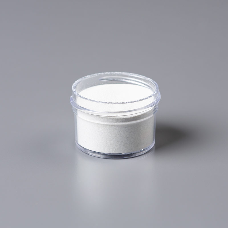
First, I embossed the image on 
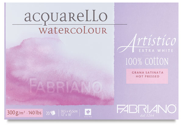
hot press watercolor paper with platinum embossing powder. That's sort of a warm silver color, if that makes sense. I used the Inkon3 Embossing ink. This is a very well-inked pad, but what I like about it is the foam is firm - even firmer than a normal foam ink pad, more like a felt/linen pad - and so it doesn't make a mess of your stamps.

Then I picked a handful of my favorite Tombow Markers (N65, 725, N57, 925, 173, 055) and started to color. The blue and yellow were easy, and that's what I started with.

But then I added the bright orange and pink on the curved space and it was CRAZY bright. Like fluorescent almost, and not super harmonious. But I kept going - picking out the colors for the band around the edge and working my way through it. I was listening to the Dirty John podcast at the time, so I was pretty riveted. (The list of my favorite podcasts is here.)

When I was done adding color, it was just too bright. So I started adding this grey as a shadow here and there, and it instantly improved the overall look. But the orange in the circles was still too bright, so I actually took the pink marker and colored over the orange and shaded them with grey, and that fixed my color issue. Now it was looking like vivid stained glass. But it still needed something, and I had lots of podcast ahead of me, so I decided I'd add some details with my teeny Micron pen. Black pen makes everything better.

First, I flicked little lines in the flower petals - BOOM. I liked that a lot. So I did that to the vase. Oh yeah. Now I was in a groove. Then I decided I loved the way the pen made the vase look so crisp, so I decided to outline the triangles.

Well when I saw how amazing THAT looked, I knew I was committed to outlining every single colored area. I'm crazy like that.

Yes, I finished the podcast during this card, but man am I glad I did. I LOVE how sharp and crisp this is when it's all said and done. If you think about the way stained glass really looks, the lead is raised, so right next to the lead it really is very dark right next to it, and so it ended up looking very dimensional and realistic. And the colors are so saturated and pretty, it does look illuminated, especially on a black card. I went back and forth between white and black, and had to get some outside votes, but it definitely belongs on the black.
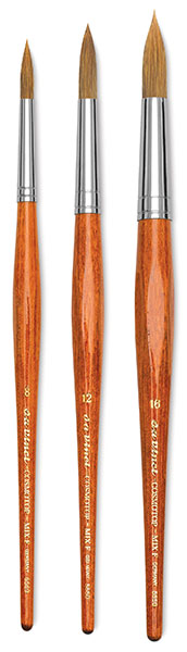
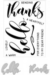
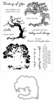
Craft Stash UK Stained Glass image by Understand Blue
Pretty Quick Stained Glass Potted...
[ CST ]
Pretty Quick Stained Glass November...
[ CST ]
Juicy Clear Embossing & Watermark Ink
[ INK ]
PW117 Platinum Embossing Powder |...
[ HA ]
Tombow Dual Brush Pens and Sets
[ BLIC | SSS ]
Sakura Pigma Micron Pen
[ BLIC ]
Fabriano Artistico Extra White...
[ BLIC ]
Power Poppy OLIVE AND OAK Clear Stamp...
[ SSS ]
Daniel Smith Extra Fine Watercolors
[ BLIC ]
Da Vinci Cosmotop Sable Mix F Brushes...
[ BLIC | ELH ]
MISTI Stamping Tool
[ MSW | HA | SSS | ELH | MFT | SBC ]
Lawn Fawn STAMP SHAMMY Cleaner LF1045
[ SSS | ELH | CST | ART | SBC ]
Rotatrim Professional Series Cutter -...
[ BLIC ]
Multipurpose Liquid Glue by Stampin' Up!
[ SUP ]
Nesting Porcelain Bowls - BLICK art...
[ BLIC ]
Heat Tool (Us And Canada) by Stampin'...
[ SUP ]

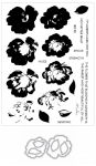
So check out these beautiful images, and most importantly - don't give up on coloring projects. When Kathy was here for her coloring challenge on the road event, a sweet student in the class brought me her watercolor project and let me add to it. I worked on it all day in between teaching sessions, and here is the before and after of a painting she wanted to throw in the trash. We all learned so much. It's more about patience than skill. And if you have the patience, you will get the skill. I included this stamp image in the supply list above. 

Before and After Watercolor by UnderstandBlue

Hope you have a great weekend lined up. I'm off to a retreat next week, so check out Facebook and Instagram for shenanigans and I'm sure lots of bacon photos.

Loveyameanitbye.

Wednesday, April 18, 2018

Toothless

I know a lot of people think they have adorable black cats, but if I'm being honest, I have the cutest one. 

I'm not saying yours aren't cute - all cats are cute. But Maddie Bat is the cutest. 

If you saw the movie How To Train Your Dragon - and if you haven't, stop reading this, leave work, leave your children, whatever and go watch it right now - you are already in love with Toothless.

But that also means you are in love with Maddie, my black cat, who I am nearly certain was the inspiration for that character. If not Maddie (from them creeping on my blog), then definitely the adorable black cat (but not as adorable as Maddie) of whoever did the animation for that character.

It's SO incredibly cat-like in every way, but has that sort of strong-willed, soulful quality of especially a black cat that my fellow black cat owners can recognize immediately.

I read a book on cats once and read a study about how coat color is the strongest determinant of behavior in cats, and I have to say, my real life observation of a large number of various types of cats bears that out. Black cat magic, tortie-tude, tabbies, orange tabbies - they are all so unique.

All that to say, I finally found a dragon stamp that reminds me of Toothless/Maddie. It's this Magic Dragons set - how cute is this??

Magic Dragons 4x6 Clear Stamp Set
[ INK ]
Magic Dragons Coordinating Die Cuts
[ INK ]
Fadeout No Line coloring Detail Ink
[ INK ]
Sunburst Bold Prints
[ HA ]
Sunshine & Rainbows Photopolymer...
[ SUP ]
Daniel Smith Extra Fine Watercolors
[ BLIC ]
Da Vinci Cosmotop Sable Mix F Brushes...
[ BLIC | ELH ]
Fabriano Artistico 140 lb. Cold Press...
[ AMZUS ]
Basic Black 8-1/2" X 11" Cardstock by...
[ SUP ]
Whisper White Cardstock - Thick
[ SUP ]
MISTI Stamping Tool
[ MSW | HA | SSS | ELH | MFT | SBC ]
Lawn Fawn STAMP SHAMMY Cleaner LF1045
[ SSS | ELH | CST | ART | SBC ]
Rotatrim Professional Series Cutter -...
[ BLIC ]
Multipurpose Liquid Glue by Stampin' Up!
[ SUP ]
Nesting Porcelain Bowls - BLICK art...
[ BLIC ]
White Stampin' Emboss Powder (109132)
[ SUP ]
Heat Tool (Us And Canada) by Stampin'...
[ SUP ]
Juicy Clear Embossing & Watermark Ink
[ INK ]

And the sentiment exactly describes Maddie too. :)

First, I used Fadeout Ink to stamp these little guys and die cut them with the matching dies. Then I watercolored them with just three - okay, four - colors: Phthalo Blue Green Shade, Quinacridone Pink, and Quinacridone gold, shaded with Aussie Red Gold.

I cut clouds with the Sunshine & Rainbows Dies, and sponged a bit of Fadeout Ink on them to put each dragon on.

For the background, I used this Bold Prints stamp, and I was just going to use Fadeout Ink on it, but do you remember this card? Apparently some of the ink from that was still on the stamp  - I'm amazing like that - and so a little bit transferred, and I liked it, so I used it.

I embossed the sentiment in white, and this was the first time I tried the Inkon3 Embossing ink. It's a VERY firm pad, which I love - so your stamp doesn't mush down into it and get embossing ink everywhere. This is something I've never seen before in an embossing ink. I think it makes for cleaner embossed images.

The little blue one on the left is the most Toothless-y and so cute! But of course, not as cute as the real thing!


A few important updates before I go:

  • Stamp-n-Storage is lightning fast, and already has a new ink pad holder to accommodate the new Stampin' Up! ink pad design coming in the new catalog. You can see the various configurations here. If you don't want to buy a new holder, they are offering spacers to position the ink pad for easy retrieval in the existing hold here. I will probably get both, because I do plan on keeping my existing ink pads, but I will get the new and returning colors and put them in the new holder.
  • I have updated my favorite podcasts and favorite crafty things list on this page with some recent loves. 
  • I recently found out something horrifying if you are a gluten-free or low carb person who also eats at IHOP - I am NOT gluten free and I don't eat at IHOP, but this shocked me when my friend Dana told me this. They put their PANCAKE BATTER into their eggs. So if you're all keto-strong and having an omelette or scrambled eggs, you are so getting sabotaged at IHOP and probably other places. They claim it makes them "fluffy". I find omelettes revolting, and one of the few egg dishes I can't stand, but as a person with food allergies, I find this pretty alarming. So please don't eat eggs at IHOP if you have allergies or are trying to have a low-carb diet. They do label the allergens on their website, but their actual menu says "allergen info available upon request." I don't think of an omelette or scrambled eggs as containing wheat or soy, so I'm not sure I'd even ask about that.  Now I will, I guess, because I bet other restaurants do it. Crazy. Actually - I'm not even sure why pancake batter would have soy in it anyway. It seems like everything has soy in it now - somebody must have a bunch of soy they need to get rid of.
  • Speaking of food allergies - if you are lactose intolerant or dairy allergic - Haagen Dazs now has a dairy free line of ice cream using coconut milk, etc. I am a big HD fan because they use actual natural foods in their ice cream - many of their flavors are just cream, eggs, sugar, vanilla, etc. so it's nice to find an allergy/intolerance line of their ice creams since summer is coming! 
  • A rare TV recommendation from me, because I don't really like TV - if you are not watching Sneaky Pete - you need to binge it. Trust me.
Loveyameanitbye.


Monday, April 16, 2018

Altenew April 2018 Stamp/Die Release Blog Hop + Giveaway

Have you had to get bids recently on any type of work on your home?

I was in the construction industry for an eternity, and I remember going through the RFP process.

The only thing more tedious than submitting an RFP is watching Mark Zuckerberg explain Facebook to a group of people in Washington whose average age is 147.

However, when you are on the accepting bids end, you start to understand why RFPs are the way they are.

We are getting bids on a roof right now, and every single bid is as different in every possible way from every other bid.

Imagine that all my bids are cats. One is a tortie. One is a Siamese. One is missing an ear. One is all black with an orange infinity symbol on its belly. One is a mountain lion. One is a dog, so that's the only one that is easy to understand and eliminate.

Some break every single expense out. Some lump it all together. Some use completely weird and vague terms to refer to what should be common things used on every roof, like nails. So one bid might say "nails" while the other one says something like "numerous slender, galvanized, pointy uniting sticks."

If I had it to do all over again, I'd just give into the darkness that is the RFP and require everyone to fill out MY bid form in my format.

But by the time I can make that happen, our roof will be even older than it is now, and we can't have that.

So I avoided making a decision by setting aside this weekend to make cards with new stamps I haven't had a chance to use yet. So now I probably have enough cards for a month of blogging!

First up - this month's amazing Altenew goodness. When I saw this ginormous die & stamp combo, I squeaked a little.

I LOVE ginormous sentiments, and even more so if they are in die form.

For this first card with this beautiful Mega Hello Die, I first cut a negative space into a piece of white cardstock, saving all the little pieces. Then I die cut two more negatives, one from blue and one from green, and I glued them behind the white opening to create colorful drop shadows. Then I mounted this whole sandwich onto some black and white paper, and added a sentiment from this beautiful stamp set.

Mega Greetings Stamp & Die Bundle
[ ALTN ]
In My Thoughts Stamp & Die Bundle
[ ALTN ]
Lemon Lime Twist 8-1/2" X 11"...
[ SUP ]
Tempting Turquoise 8-1/2" X 11"...
[ SUP ]
Whisper White Cardstock - Thick
[ SUP ]
Basic Black 8-1/2" X 11" Cardstock by...
[ SUP ]
Jet Black Crisp Dye Ink
[ ALTN | SSS | ELH ]
Pick a Pattern Designer Series Paper...
[ SUP ]
MISTI Stamping Tool
[ MSW | HA | SSS | ELH | SBC | MFT ]
Absorber - Synthetic Cleaning Cloth
[ AMZUS ]
Rotatrim Professional Series Cutter -...
[ BLIC ]
Mudder 10 Pack White Buffer Sanding...
[ AMZUS ]
Xyron ADHESIVE ERASER 23675
[ SSS | ART | AMZUS ]
Bone Folder by Stampin' Up!
[ SUP ]
Multipurpose Liquid Glue by Stampin' Up!
[ SUP ]
Sizzix BIG SHOT EXPRESS Gray and...
[ SSS | CST | ART | BMS | SBC ]

That put me in sort of a modern art mood, so I made even a bolder one, but using the positive die cuts leftover from the card above. 

On the white layer, I stamped the largest of the Halftone Circles all over it for a fun, pop art texture. Then I again glued the colored cuts behind the white one, and mounted all that on black cardstock. 
Mega Greetings Stamp & Die Bundle
[ ALTN ]
Halftone Circles Stamp Set
[ ALTN | SSS | ELH ]
Lemon Lime Twist 8-1/2" X 11"...
[ SUP ]
Tempting Turquoise 8-1/2" X 11"...
[ SUP ]
Whisper White Cardstock - Thick
[ SUP ]
Basic Black 8-1/2" X 11" Cardstock by...
[ SUP ]
Jet Black Crisp Dye Ink
[ ALTN | SSS | ELH ]
MISTI Stamping Tool
[ MSW | HA | SSS | ELH | SBC | MFT ]
Absorber - Synthetic Cleaning Cloth
[ AMZUS ]
Rotatrim Professional Series Cutter -...
[ BLIC ]
Mudder 10 Pack White Buffer Sanding...
[ AMZUS ]
Xyron ADHESIVE ERASER 23675
[ SSS | ART | AMZUS ]
Bone Folder by Stampin' Up!
[ SUP ]
Multipurpose Liquid Glue by Stampin' Up!
[ SUP ]
Sizzix BIG SHOT EXPRESS Gray and...
[ SSS | CST | ART | BMS | SBC ]

Since I had the Halftone Circles out, I used that as a backdrop for my funky, modern color combo on my layering flower from Strength Blooms. I wanted to see what it would look like if I layered a bright red ink on top of two blue layers - and it came out so fun! Since I had used two primaries, I added a third - which was just a scrap from a step-out for my Drunken Acrylic Reveal tutorial. (You can see that video here.) 

I finished that off with more drop-shadow letters, this time with the Calligraphy Alpha dies, silver glimmer paper and black cardstock. I love the wine color that resulted from the bright red and blue inks layering.
Strength Blooms Stamp & Die Bundle
[ ALTN ]
Calligraphy Alpha Stamp & Die Bundle
[ ALTN | SSS | ELH ]
Halftone Circles Stamp Set
[ ALTN | SSS | ELH ]
Whisper White Cardstock - Thick
[ SUP ]
Basic Black 8-1/2" X 11" Cardstock by...
[ SUP ]
Silver Glimmer Paper by Stampin' Up!
[ SUP ]
Ruby Red Crisp Dye Ink
[ ALTN | SSS | ELH ]
Evening Gray Crisp Dye Ink
[ ALTN | SSS | ELH ]
Ocean Waves Crisp Dye Ink
[ ALTN | SSS | ELH ]
Dusk Crisp Dye Ink
[ ALTN | SSS | ELH ]
MISTI Stamping Tool
[ MSW | HA | SSS | ELH | SBC | MFT ]
Absorber - Synthetic Cleaning Cloth
[ AMZUS ]
Rotatrim Professional Series Cutter -...
[ BLIC ]
Mudder 10 Pack White Buffer Sanding...
[ AMZUS ]
Xyron ADHESIVE ERASER 23675
[ SSS | ART | AMZUS ]
Bone Folder by Stampin' Up!
[ SUP ]
Multipurpose Liquid Glue by Stampin' Up!
[ SUP ]
Sizzix BIG SHOT EXPRESS Gray and...
[ SSS | CST | ART | BMS | SBC ]

So I'm part of a blog hop for this April collection today, and the next person on the hop is my sweet friend Debby.


They will be giving away $50 gift certificates to SIX lucky winners who leave comments on the hop by the 21st, so be sure and enjoy all the goodness and stop by at the Altenew blog to find out if you're a winner! Winners will be announced on the 22nd.

By then, hopefully our bid process will be done with, and I can get back to thinking about crafts. Or really anything but roofing nails.

Loveyameanitbye.

Related Posts Plugin for WordPress, Blogger...