*Compensated affiliate links may be used at no additional cost to you. No posts here are sponsored or paid.*
Happy early 4th! I have a fun, patriotic video for you today with some insider scoop from my childhood! The 70s were wild, y'all.
On the card in the video - I will tell you - you can see it better in the video the distressing I did - because metallic things are so elusive to photograph so please see the video for a better representation of the background!
*Compensated affiliate links may be used at no additional cost to you. No posts here are sponsored or paid.*
WOW June was short. I guess that one day off the end makes a bigger difference than you think, I'd guess!
Last year I remember it was an unseasonably cool 4th, but there's no danger of that this year. I bought this fun new Japanese weeding tool that I've been dying to try out, but even right at dawn, it's already hot enough to make me lose my will. I really need to though - I have a very pernicious grass from the neighbor's yard invading my flowerbed. The roots are just awful so I love the angle and the super sharp blade. I'll let you know how it goes.
This month's Hero Studio Card Kit has this fun mashup feel of beachy and sort of retro imagery. The little details in the kit are incredible - such as the little footprints!
Today is the sneak peek day and you are going to see some really fun peeks, but I can't really tell you too much more about what's in there!
I'll give you the deets on this card on Monday! I have some fun tricks for sand and whatnot.
What are your plans for the 4th? I just realized I need to get some food! LOL. I've been doing the summer eating plan - reheating in the microwave only - my freezer full of earlier cooked food is my friend right now. I'm happy winter Lydia made some lasagne. 😂
Loveyameanitbye.
CURRENT COUPON CODES
10% off stamps, stencils and dies at TRHD here with UNDERSTANDBLUE
*Compensated affiliate links may be used at no additional cost to you. No posts here are sponsored or paid.*
My core temperature is HIGH as I write this. I spent the morning repotting some of my outdoor plants - using up three bags of potting soil in the process so I am whooped. I only got hit in the face by one cicada, and I didn't realize how very rootbound my garlic chives were. I moved them to a container that isn't deeper, but much wider so hopefully they will spread out. My creeping thyme was also very root bound so I moved that to one of my Earth Box containers too.
It was HOT out though - so you can't stay out for too long.
So today I'm all about the cool, beachy vibes and one gardening vibe, which I'll start with. This is a really fun combo - a die and a 3D embossing folderreally fun combo - a die and a 3D embossing folder that you run through together to get these beautiful shaped, embossed panels/tags. I used distress inks and oxides to blend and splatter it, highlighted some with my finger and white paint, and added gold leaf around the edges. I filled in the mushroom spots with white gel pen. It's so pretty! I just love it and it speaks to my inner gardener.
The beachy vibes are starting with this little watermelon and his watermelon popsicle! Try not to think too hard about why he's a cannibal, okay? He's just enjoying his summer, and it's none of our business. The background is just ink blending on this embossing folder. The sentiment is from this set. The watermelons legs are the little swinging element - I'll put a video in my IG story!
The next one is designed by my friend Dawn! The CUTEST little seagull die! I used the layering scene stencil, but used the back side for a different orientation - I wanted him facing the sentiment - so that's a fun trick you can do with any layering stencil.
Speaking of stencils - how cute is this beachball stencil? So classic - but I've never seen a stencil like this. I added this condo key and this sentiment.
*Compensated affiliate links may be used at no additional cost to you. No posts here are sponsored or paid.*
Hi friends! I have SUCH a fun video coming on today's card on Tuesday and I can't wait for you to see it. It's a throwback to some techniques that were very popular when I started stamping. So stay tuned for that.
But I'll show it to you tonight! It's part of this amazing release which has some amazing Americana, travel themes and of course birds and flowers - so check that out here.
I used thismodern map stencil and turned it vintage! The ticket - which reminds me of the stories that gave me the name of this blog - more on that in a second - you cut into two pieces with the dies - the frame and the ticket and it has two different matching stamps.
*Compensated affiliate links may be used at no additional cost to you. No posts here are sponsored or paid.*
MORE SQUIRRELS PLEASE! You can never have too many and I have a cutie for you today.
This is all part of the new Studio Kit and I think you're going to love the changes, especially if today is any indication!
Now this is not a squirrel themed kit, but it contains a squirrel, so I must squirrel! I started with this gorgeous layering houses stencil. This is a four part stencil, so I used the following colors: Lemon Yellow, Ultra Pink and Azalea.
The power line is in two parts - the pole and the line, which I stamped twice, and then carefully placed my little squirrel. He looks like he might be in Europe. They do get around!
Here's what's in the Kit - it's a DOOZY! Look at that paper! And the rub-ons! 😲
Now the upgraded kit is now called "The Whole Studio". The house stencil is in that one.
I decided to make several cards with the other layering stencil that's in the extras this month. It's a fun, Moroccan style layering stencil and you can rotate it to get different looks - just use two, three or four rotations as you wish. I used pink and blue and yellow in various combos.
*Compensated affiliate links may be used at no additional cost to you. No posts here are sponsored or paid.*
The first two babies of Clarence that I named were Tail and Tailette - both of whom Clarence taught to trust me, and who come see me daily to this day.
I'm SO excited that Tailette now has her own stamp sets! And they're SO cute!! She's having some outdoor adventures in this series, as is her nature.
In this set - she's brave enough to sleep in a tent - which I would never do - but it beats being in a tree in the storms we've had recently! Luckily all my squirrels have survived them! I used the same paper and the squirrel from this Tailette set. The sentiment is from this set.
There are a few misconceptions about squirrels - firstly that they can be rabid. They really can't - and neither can rabbits. Strange rodent quirk of science. The second misconception is that they are out chewing on things at night - they are not. Squirrels head for the nest at sundown like we do. If something is chewing on your lights or gardens at nice - it's mice or rats. So this little version of Tailette is a complete lie, because it's way past her bedtime, but I could not resist a card with with this adorable van out in the desert southwest. The Tailette image and sentiment are from the same set, and both papers are here.
I hope you had a great weekend! I'll be back with even more squirrels in a few hours!!
There's a hop today with a giveaway too! Blogger is being stupid with links today, so please head here for the list.
Loveyameanitbye.
CURRENT COUPON CODES
10% off stamps, stencils and dies at TRHD here with UNDERSTANDBLUE
*Compensated affiliate links may be used at no additional cost to you. No posts here are sponsored or paid.*
I have several journals from this incredible artist and one of my original Twitter friends from 2009 - Renate. You'll see one of them in today's video. They are all hand painted and the paper is hand torn - they are beautiful.
Each one comes very carefully packaged and she wraps them in this newspaper that is much higher quality than American newspaper - the ink doesn't smear, the paper is thicker and has a rosy tone.
I absolutely cannot throw it away, so today I'm making it into cards.
For the newsprint background, I first used a glue stick to adhere the paper to cardstock. Most glue sticks are absolutely terrible. If you watched my pandemic lives you know that I tested every glue stick available in the US in 2021, and there's only one that actually works. I'm stunned that people continue to use and promote some of the more common office supply store brands.
Then I put a thin layer of chalky gesso on it so you could still see the print - but I wanted to tone down the rosy color a bit to match my butterfly. I added splatters and marks with a thick black acrylic marker.
Since I had more newspaper and more butterflies - I made more cards!
I even have one piece leftover that will be a tag.
Without further ado - here's the video in which you will also see the journal!
Loveyameanitbye.
CURRENT COUPON CODES
10% off stamps, stencils and dies at TRHD here with UNDERSTANDBLUE
*Compensated affiliate links may be used at no additional cost to you. No posts here are sponsored or paid.*
I have talked about complementary colors a lot over the years - mostly because I think it's the one thing you can use to really make your coloring in any medium really pop.
But you don't have to do direct complementaries - you can sort of come at them from an angle and it's still very effective. I made a card today to show you want I mean and how it works.
I'm using a little mermaid image for this with two distinct parts - the mermaid and the shell. To keep it simple, I used four colors (except for the skin tones). The four colors are Cerise, Prawn, Nile Blue and Veronese Green. You can see that the green is used to shade the blue. So instead of choosing orange as a complementary to the blue, I chose a warm red. So the complementary relationship isn't a direct complementary - it's more subtle. The green that I used for shading is also almost a direct complementary to this same red though, so using it to shade the non-direct complementary increases the contrast overall. Same with the hot pink - that is nearly a direct complementary to the green as well - but when you look at this image overall, the overwhelming feeling you get is that it's a blue image, right? That's because the shading color is adjacent to blue on the color wheel.
*Compensated affiliate links may be used at no additional cost to you. No posts here are sponsored or paid.*
There was a HUGE debate a few months ago online about yellow cake vs. other cakes, and I was surprised at how strong people's feelings were about this topic! It got quite heated.
I'm not generally a cake person - pumpkin pie is my jam - but the whole debate jolted loose a memory for me of a cake my childhood friend's mom made once - it was Duncan Hines I think - some mix - but it was literally the first pink cake I ever saw in my life and I was enchanted. It was strawberry, I think.
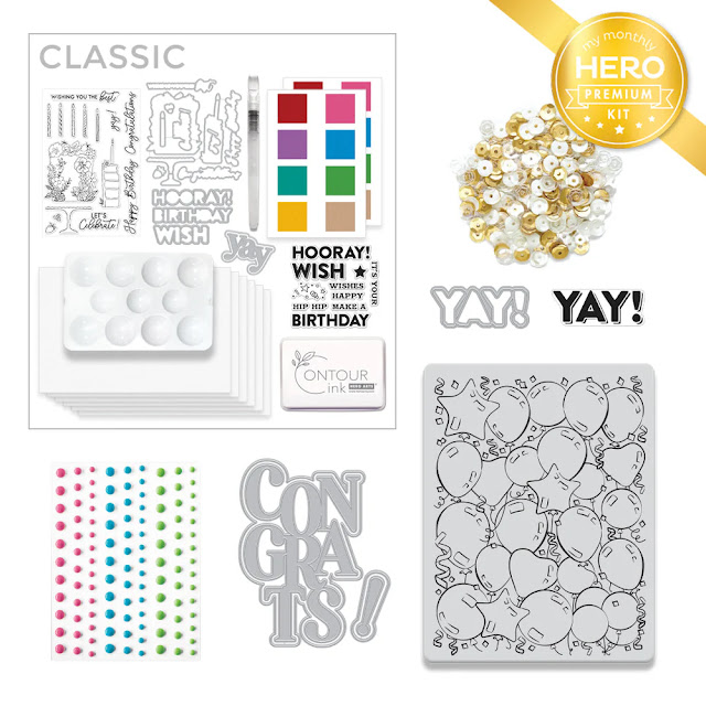
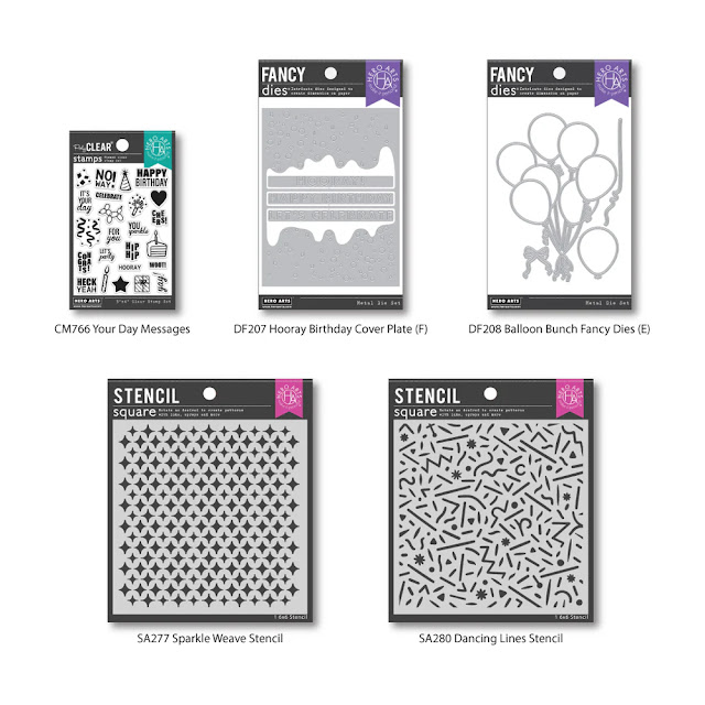
She made it with chocolate frosting, because no matter the cake, he loved chocolate frosting. The cake was a delight and my inspiration today with the new Hero Arts kit - a birthday theme.
I decided to go a little vintage with the main image and do no-line watercolor over a shaker - the sequins are included in the kit. HINT - the liquid watercolor I used is a little Easter egg for what's in the kit, but of course I'm sworn to secrecy. So come back on Monday.
*Compensated affiliate links may be used at no additional cost to you. No posts here are sponsored or paid.*
It will NOT stop raining!! I just want to weed my flowerbeds and it's too nasty out. This morning I got up and my poor little wet squirrels were all waiting for me like in a cafeteria line poor critters. One of them is Monkey's baby - she is Clarence's tiniest baby - and he is even tinier so he's just learning to forage and it's hard with all these storms. He's figured out pretty quickly that I mean food though so he'll be okay until the sun comes up.
So I thought I'd just roll with it and do a tropical theme today.
I did my Blackout Embossing technique with a dark grey ink pad over these embossed leaves - it looks very dark and jungly, so I made my little birds brighter with OLO markers. I felt like if I didn't leave the branch white it would get lost on that darker background and I like the way that turned out! The sentiment is from this set.
For the last card, I decided to make it in a Peter Max style - I used to have these awesome Peter Max coloring books as a kid I've referenced a few times, and that is what the style of this image reminded me of and the stencil just brought it home. The stencil is a layering one - so on the second one I just made the same ink darker.
A little white gel pen did the trick!
After I die cut it, I colored the white edges black for a little extra pop.
What are your weekend plans? I have to do indoorsy stuff I guess! There's always a closet to purge, right?
I've said this on Facebook, but not here - you HAVE to watch Will Trent.
Loveyameanitbye.
CURRENT COUPON CODES
10% off stamps, stencils and dies at TRHD here with UNDERSTANDBLUE