I get it.
Sometimes looking for inspiration (which I used to spend a LOT more time on than I did creating), can actually diminish your own creativity and squash your own ideas.
I used to start every card by typing the name of the stamp set into the Splitcoast gallery to see what other people had done with it.
But over time, I actually found that to dampen my ability to come up with my own ideas. It wasn't really inspiration at all - it sort of prejudiced me by filling my head with just the ideas I saw.
After Google Reader got killed off - I stopped doing that completely - and what do you know? All of the sudden I had more ideas than I knew what to do with! It was so liberating.
I started to develop my own tricks for how to use a new stamp set, and I'm going to share a few of those with you today.
The first trick is to COMBINE sets. Sometimes I hear people say - well that's just a bird set - I can't just make bird cards. Or - that's a teacher set - I don't make teacher cards. I'm here to tell you - stop saying that.
I start every card by STARING at the stamp set. For a while, actually. I just study the images and think about ways to use them. I often then put them away and come back to them. I think about them when I'm watching TV or before I fall asleep, and when I'm not actively working on stamping, that's when my best ideas come.
Then, I take out other stamps by the same company and lay those out on my desk, and things just fall together.
That's what happened with today's cards, and it's a common part of my process.
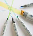
Next, if I have just yesterday done a post with an hour long watercolor video - I might not feel like coloring. So I grab my Copics and I do VERY simple coloring - I call it "cartoon" coloring, and it's a trick I learned from my friend Anna Wight like three hundred years ago, and I have never forgotten it. Thanks Anna! She taught me to use non-blended color. As you know - I LOVE blended color - that's how I watercolor. But the non-blended color is so quick, and cute and impactful. When I need a colorful, but quick card, this is my go to.
Finally - I like to use an image in an unintended way. You know this about me.
So on this first card, with the AMAZING Leading Ladies Medical Lady set (I have a million nurse friends and family members), I decided to use the little nurse cross stamp as sort of a structural divider on the card. I put the card front horizontally on the long side of the MISTI, with the right edge at 2.5". Then I shifted it 1" for each time I stamped the cross with Red Hot ink, left and right.
Both the new Leading Ladies sets are cool, because the ladies themselves don't have to be the characters they are in the sets - it's the accessories that make them into their character, so if I weren't making this a get well card, she could easily just be hanging out in her comfies. She does come with matching dies.
But to jazz up her scrubs, I stamped her again on masking paper, and then cut out the open areas of her scrub top, and laid the negative space mask on top of the image, and then stamped the floral from this cute Brandi Kincaid set onto her shirt. I colored it with the following Copics: E15, E09, E11, E51, E27, BV000, E23, BG34, G03. I did the comic coloring with hard lines for shading, and stamped the sentiment and little heartbeat stamp in Nocturne.
|
Next, I really did the comic coloring very quickly on the Leading Ladies teacher set. I LOVE all things teacher, as I used to be - and I guess still am - one, but I wanted to show you another way to combine three sets for a totally different feel than what you get when you first see the set.
I actually used the sentiment from the Medical Lady set, but used the lucky cat from this set. HA! She just looks like a girl who is very proud of her lucky cat. Who wouldn't be?
I googled lucky cat to get a traditional color scheme for my kitty, so I added that green scarf.
The side strip is from this turnabout. I'm sad to use up my last scrap from this post.
|
And don't feel like you need to spend an hour coloring EVERY card. Just have fun and use the comic method and make someone's day by popping that in the mail.
Now I wanted to update a previously published recipe. I recently became lactose intolerant (scream) and so I've had to modify a LOT of my recipes.
I made one last week that we agreed was even better than the original! I actually made two batches so I could freeze one, because we ate leftovers all week after I cooked the first modified version.
Here is my updated Enchiladas Suiza recipe. It's DIVINE.
Also - I've updated my podcast list and my other Favorite Things lists. You can see them all here.
Loveyameanitbye.


Love this post! Love how you stretch your stamp sets and combine them so well. That second card is soooooo cute!
ReplyDeleteLove this idea of combining stamp sets Lydia. TFS!
ReplyDeleteWell guess what's for dinner tomorrow night! Thanks for the reminder and tips to look at your products in a different way. I've been in a rut so I'll take your advice. Fantastic cards!
ReplyDeleteHi Lydia, love your cards as always, but love your humor JUST AS MUCH! :D
ReplyDeleteI believe you have a Facebook group where you join for the split in Daniel Smith watercolors - if so, can you direct me, I'd like to explore the option; thank you!!
I really like your ideas. I used to fret about color blending and it took the joy out of coloring, so I decided I wouldn't worry about blending and it has become enjoyable again. I like your comic coloring and Ellen Hutson stamps are awesome.
ReplyDeleteI love these cards, Lydia, and agree that projects are best when the come from a clean slate. So rewarding to make something with little-to-no outside inspiration. I particularly love your "feel better" card - the facial expressions are perfect.
ReplyDeleteLove these sweet cards Lydia! Your coloring on them is so good!
ReplyDelete