Saturday, August 12, 2017

Heck Yes

One of my fondest wishes for the new catalog was granted many times over, and I'm so excited about it!

I LIKE BIG SENTIMENTS AND I CANNOT LIE.

(I'll wait while you pull that up on Itunes and get your groove on for a bit.)

I begged for YUGE sentiments, and they did it. And I love all of them.

Because I like to do dramatic backgrounds, I often times only want to add a sentiment, and it needs to be bold to compete with either my bright colors, or, in today's case, my love of a mostly white card.

When I first started stamping, before I found my own style, I did not make clean and simple cards. As far as I know, CAS had not even really emerged as a cardmaking style yet. We were all in the throes of a viral embellishment phase, where the more eyelets, brads, mini brads and ribbon you could throw at a card, the better you felt about yourself as a person.

Praise the Lord that fell by the wayside. Ribbon gives me the heebie jeebies now, but just like 80s hair seemed like the right thing to do at the time, my cards were drowning in poofy organdy hideousness for a long time. Makes me shudder just thinking about it.

But somewhere along the way, I fell in love with white cardstock. I love the crispness of color and black ink on white more than all the things. Maybe it's my aging eyes that are partially to blame there. But I remember vividly sitting in Edward Tufte's presentation and hearing that the highest resolution "display" is actually black text on white paper. Our digital world can't even come close. And that made me realize why I love CAS cardmaking and white space so much - it works better. It's high-res.

I have been on a whole house belongings purge for a few years - since I remodeled my studio - and I go crazy on something like bookcases from time to time and get rid of tons of books, or whatever the belonging of the day is that I want to have less of. My house is very similar to my cards - there's not a lot of extra stuff in it, and I'd still like to have way less. I can't stand clutter, and I feel like we all have too much of it. I was telling someone the other day how dumb wedding registries were when we got married. I thought how insane it was to give two people TWELVE PLACE SETTINGS OF BONE CHINA when their sole other possessions in the world consisted of a second hand futon and three Whataburger coupons. What kind of crazy is that? And for us to have that plus twelve place settings of everyday china is still nuts. There are two of us. We could keep a Greek party going for days with all our plates they could smash.

I guess the culture has just changed, and I like it. Less is more.

But during my last book purge, I did sit down for a few minutes with Tufte's book - which is ESSENTIAL - if you do not have it, IMMEDIATELY buy it along with the companion books. Especially if you love both art and data. He's such a genius, and I really do believe that he has had a big influence on the way I style my art. Something about his approach bends toward rich minimalism - how much you can do with very little in the way of visuals. I love it.  So that's what I'm doing today.

This is another card I made for the Clearsnap Product Focus, again with the MISTI Ombre I described here, but with red and purple thrown in. That Jelly ink is absolutely my FAVORITE. And that's saying something, both from a blue fan and from a person who objects to most purples. This is a brilliant, royal color that makes my eyes happy.

Heck Yes by UnderstandBlue


I just love that sentiment. The whole set is great, but these remind me of doodled lettering I used to do when I was a kid. The highlights make them so dimensional. Funky and retro goodness, there.

So heck yes we need to celebrate Caturday! I am going to TRY to spend the whole weekend in creative pursuits. We'll see how that goes.

LoveyameanithaveagreatCaturdaybye.

Friday, August 11, 2017

The Subtle Difference Between Right and Wrong

When people ask questions about "the right" supplies for a particular medium or technique, I always flinch a little. While there are definitely some "wrong" supplies for certain mediums and techniques, the "right" ones can be a bit more subjective, so I decided to explore that topic today.

One example of a "wrong" medium is trying to substitute photo paper for techniques that use glossy cardstock.

Photo paper has an emulsion for the coating. Glossy cardstock has a clay coating. As my good friend Walter White would say - it's all about the chemistry! Ink will behave very differently when it interacts with those two surfaces. That emulsion can become sticky when it interacts with ink. So when you are trying to recreate something you saw on glossy cardstock, don't try it with photo paper - that would be the wrong supply. However, if you are trying to make coloredy sticky paper, then photo paper would be the right supply :).

But none of that should ever get in the way of just experimenting on your own. So if I show you a project you want to recreate, and you ask me what the "right" xyz is - I'll tell you what I used - but that doesn't mean you shouldn't try other things you might like better. I try to always encourage people just to play before they decide what's "right" for them. Right meaning the one that you have the most fun doing.

Today's projects are a great way to illustrate this. I wanted to show you what a big difference substrate can make with the exact same inks and process.

I'm THRILLED that glossy paper is back in the catalog now. I've really missed it. I love the way ink blends on that surface, and how the colors ratchet down and become less vivid, more dreamy. So I thought I'd show you the same inks on both glossy and a water-friendly uncoated cardstock like Bristol Vellum. (Vellum refers to the finish - this is a cardstock, not a transparent vellum.) The difference is pretty remarkable.

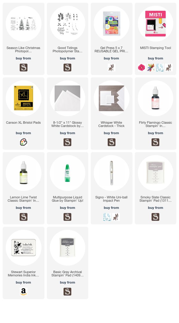
This first background was done in my Gel Press on glossy. Then I stamped the images from Season Like Christmas on top using the MISTI - remember the slippy, slidey stamping on glossy in the olden days? The MISTI removes all that and makes everything crisp and perfect. The tree is a three or four step tree - I only did three steps here. Really pretty. I was going for a pink and green background, since I don't like red and green. All supplies listed below the second card.
Gel Press Substrate Test with Dye Inks by UnderstandBlue
The second card used EXACTLY the same process, but the Bristol cardstock. Beautiful, vivid, fiery colors, using the same inks.
Gel Press Substrate Test with Dye Inks by UnderstandBlue

Now that's a pretty amazing difference.

But if you wanted a really bright, vivid result, and I told you that glossy cardstock was the "right" supply - you'd be mad at me. Same with if you wanted a soft result and I told you to use the Bristol vellum.

Only you know what the right thing is - so don't be fearful of a "wrong" supply - try them all and see what you like!

So this project is part of a video I did for the awesome peeps at Gel Press. My Gel Press - THAT is a right supply. I love experimenting with mediums on the 5x7 plate (linked above.)

Next month's video is pretty awesome too, I'm not gonna lie :).

So enjoy this - you'll get to see in depth the difference between wet and dry ink on glossy cardstock and also the difference between the two papers. Enjoy!


A quick note on the Hero Arts kits for those of you that stopped by on Monday - the subscription option they have makes sure you never miss a kit - because they typically sell out in hours. So if you want to subscribe for September, you can do that here - but you need to do it by 8/28 at 8 PM PST to get the September Kit. 

Remember, you can enter my August giveaway of an Arkon Pro Live Streaming Stand - the one I film all my tutorials with PLUS a ring light for the perfect lighting awesome selfies and live streams one of two ways:
  • Place an order in my store any time during the month of August for an automatic entry. BONUS - use host code 4BY7YKR7 on your order to be entered in a drawing for free Stampin' Up! products as well! 
  • Comment on the post link right here (read the instructions there) and you'll be automatically entered. If you place an order in my store AND comment on that post, you'll receive two entries!
And remember - you can always use my code - UNDERSTANDBLUE - at Arkon for 20% off. They sell all sorts of mounts - hands-free phone mounts for the car, GoPro mounts, tripods, you name it. and they are GREAT people and provide great service.

Loveyameanitbye.

Thursday, August 10, 2017

Well At Least My Eyes Are Cold

My Christmas stamp-a-stacks start this weekend and I'm so excited! It never gets really cold here, and we always start seeing Christmas imagery during our most sweltering times of the year, and it's so nice. We will never get snow, but it's fun to look at when you're lying down on your floor tile trying to cool yourself off like some sort of reverse reptile in August!

So I'm enjoying working my way through my box of Holiday mini goodies, and I combined them with the fun inks we tested in our Product Focus this week at Splitcoast.

I also like just experimenting with things that might end up on my own Christmas cards. That's kind of a unique project - I mail hundreds of cards so I need them to not be overly complicated, but I also want a wow. So I need to get my hands dirty before November getting that mix just right. I can only figure out if I want to do something 200 times by doing it.

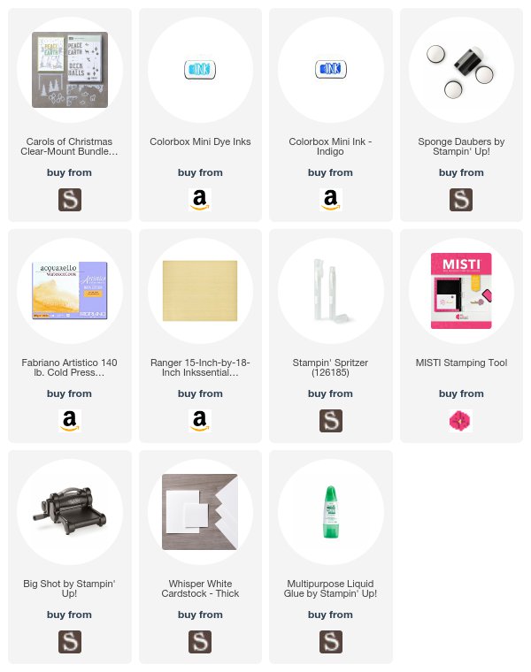
So on today's card, I wanted to do a glorious blue symphony. I did the sentiment in ombre - using the MISTI for that perfectly blended look. The way I do that is start with the first color - in this case, Indigo, and ink up part of the sentiment. Then I take a sponge dauber and pounce along the bottom edge to soften any hard lines - just lifting some of the ink. Stamp that with the MISTI, repeating several times. Then I ink up the bottom of the sentiment in Aqua, dabbing the top edge this time to soften it, and stamping it in the MISTI several times until I have that beautiful blend.
Carols of Christmas by UnderstandBlue


What's cool about these inks is their water reactivity. In my opinion, they're right up there with Distress ink this way. I just did wrinkle free distress on some watercolor paper, and then flicked water onto it and you can see the color separation on the Indigo into a pink, which is spectacular. I LOVE color separating blues and blacks and all the things. Unpredictability is my favorite, which is probably why I love cats :).

Then I die cut the trees and deer from that paper and glued them on. You can run all three of these dies through together, so it's a very quick and easy card. All it needed was a pure white background to really pop.

Are you working on holiday cards already? Do you need a break from the heat? I actually love it the most when it's blazing hot, cloud free and dry - but I don't mind cooling off my eyeballs every now and then with winter cards in summer.

Speaking of heat - I discovered on our trip to Santa Fe that the iPhone will shut down if the phone gets too hot. Despite us having the AC on stun in the car on our trip - I had the phone flat, face up on my console because we were listening to Serial, and the concentrated sun through the glass of the windshield heated my phone up to nuclear and shut it down. So I FINALLY bought a phone mount from Arkon. I never really needed one before because I just put my phone in my purse when I drive. I see way too much texting and driving here to be anything but terrified in the car. But listening to podcasts and audio books (I drive a 2004 car, so I can't get audiobooks through my stereo system) is really nice, and I wanted to be able to have my phone mounted vertically so it doesn't overheat. Arkon has manufacturer specific phone mounts here, so you can pick the one that works the best. Don't forget you get 20% off with my code - UNDERSTANDBLUE - on anything they sell. Speaking of that - I have a giveaway from them with the video filming stand I use with my phone below.


You can enter my August giveaway of an Arkon Pro Live Streaming Stand - the one I film all my tutorials with PLUS a ring light for the perfect lighting awesome selfies and live streams one of two ways:
  • Place an order in my store any time during the month of August for an automatic entry. BONUS - use host code 4BY7YKR7 on your order to be entered in a drawing for free Stampin' Up! products as well! 
  • Comment on the post link right here (read the instructions there) and you'll be automatically entered. If you place an order in my store AND comment on that post, you'll receive two entries!
They sell all sorts of mounts - hands-free phone mounts for the car, GoPro mounts, tripods, you name it. and they are GREAT people and provide great service.

Loveyameanithopeyoureyeballsarecoolbye.


Wednesday, August 9, 2017

Happy Birthday Neat & Tangled!

My sweet friend Danielle's stamp company has its fifth birthday this month. Danielle is a beautiful, funny girl that I really enjoy spending time with at retreats, and her stamp designs are as awesome as she is. You can see an interview we did with Danielle here at OCC's Crafty Chat. She's just one of my favorite people. Plus, she does a really great job of co-conspiring with me to get shoulder shots of crazy people when we are out and about. You know you can trust a person who can pull off a righteously stealthy shoulder shot.

Danielle has also had a tough year, which you can read about and possibly help with here, and so she needs a little party with some wild animals (yes, I'm including myself) today.

So she's celebrating her company's birthday with a week-long blog hop with some great friends, and I'm so honored that she included me!

We also have a Product Focus today at Splitcoast, featuring some fantastic Color Box inks, and so I'm putting my hands together today to make some super fun cards with pretty ink and adorable stamps and dies!

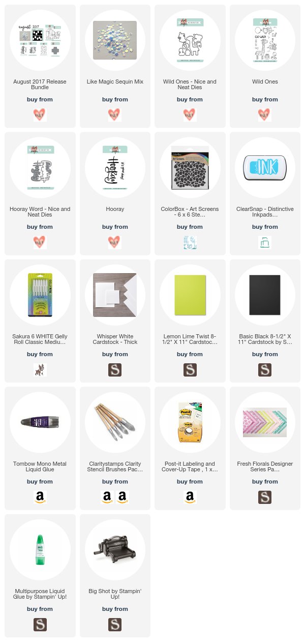
First up - a little non-traditional giraffe action with her Wild Ones stamp set and the Hooray bundle. ADORABLE!!! I colored the giraffe with Copics (YR16, YR07, Y06, YG23, FYG2), and the cardstock is Lemon Lime Twist with matching Lemon Lime Twist Designer Series Paper. Her sequins in this release are called Like Magic, and they are! They picked up the green so beautifully, but also have blues and other colors in them. They'd match whatever they are put on. To attach sequins, I always use the Mono Metal glue in the list below.
Wild Ones Neat & Tangled by UnderstandBlue


Then I thought I'd switch back to a more realistic giraffe, because I couldn't stop stamping him, and I used the Color Box stencil with two of their inks on my Clarity Stamp Stencil Brushes and the same sentiments.
Wild Ones Neat & Tangled by UnderstandBlue
 Finally, I did an ink smooshing technique with the GORGEOUS bright inks - some of them do a little color separation which I love. I watercolored the little monkey with the inks as well, and added a few white accents.
Wild Ones Neat & Tangled by UnderstandBlue
What a fun release - I love how happy everything feels.

Happy birthday Danielle! I can't wait to see what's next for you!

Here's today's hop list - be sure and comment on all the posts for your chance to win the very generous prizes - (1) $100 gift certificate to her store and (2) $50 gift certificates - that's a lot of shopping!


Wednesday August 9th

On the Neat and Tangled blog, you'll find a list of the previous two days hops, and then check back there for the next two days as well to increase your chances to win!

Remember, you can enter my August giveaway of an Arkon Pro Live Streaming Stand - the one I film all my tutorials with PLUS a ring light for the perfect lighting awesome selfies and live streams one of two ways:
  • Place an order in my store any time during the month of August for an automatic entry. BONUS - use host code 4BY7YKR7 on your order to be entered in a drawing for free Stampin' Up! products as well! 
  • Comment on the post link right here (read the instructions there) and you'll be automatically entered. If you place an order in my store AND comment on that post, you'll receive two entries!
And remember - you can always use my code - UNDERSTANDBLUE - at Arkon for 20% off. They sell all sorts of mounts - hands-free phone mounts for the car, GoPro mounts, tripods, you name it. and they are GREAT people and provide great service.

Loveyameanitbye.

Monday, August 7, 2017

Always Space In My Heart + HUGE news!!!!

I'm quite literally freaking out over this month's My Monthly Hero Kit.

There are two things about this kit that I love - the kit, which this month is a $77 kit for $34.99, but also the ADD-ONs. The kit is while supplies last, but the add-ons live forever, and they are always amazing.

BUT HERE'S THE HUGE NEWS! ALL of the add-ons are available in one fell swoop this month - you can get 11% off by ordering them all together!! (There are a limited number of bundles - so hurry!) You know I'm the queen of the "buy it all button" so I'm so excited to be able to share this - you will find that discounted bundle here. You will be excited too when you see my cards, I think.

I actually really had a problem this month because I was supposed to be working on Dare to Get Dirty stuff and all I wanted to do was make cards with this month's stuff! DILEMMA!

So I'm going to show you cards from my INSANE marathon.  Also, if you want the kit, you need to jump on it since it's limited availability. The other items are not. But this kit will fly.

Even though I narrowly avoided failing out of physics in college, I LOVE SPACE. I love painting it, thinking about it, wondering what's out there. I love space movies and books. I love the X-Files. Space is my ocean. I'd explore space forever, and water gives me the heebies. Well except watercolor. Watercolor is my favorite. So this kit and add-ons speak to my wide-open-spaces loving heart like none before it.

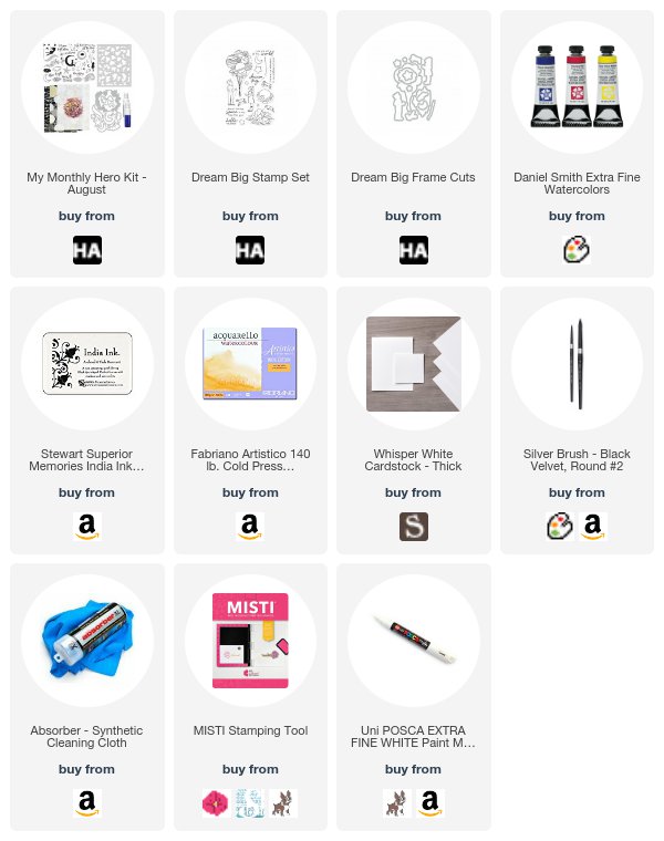
So here we go. Card #1 OMG. The images from Dream Big (an add-on) are amazing (and it comes with matching dies here.) So fanciful and sweet. To make this card, I stamped the girl image on masking paper and just masked her hand before I added the planet balloon image. The whole thing is Daniel Smith Watercolor. I just did a strip of galaxy behind the image because I wanted to have the images be brightly colored and stand out from the white of the watercolor paper. I LOVE THIS CARD. This gorgeous set has matching dies, below. The paper behind the watercolor paper comes in the kit (linked below), along with some other gorgeous papers and shimmer sprays. It's beautiful, with silver glittery dots along with the white and grey dots. It has a mulberry texture. I added stars with an extra fine Posca White pen that my sweet friend Michelle Brownstein gave me at my last retreat. I LOVE this paint pen. It's flawless.


 You know how to improve on a card you love?

ADD CATS

WHO ARE ASTRONAUTS.

SERIOUSLY.

LOOK AT THIS.

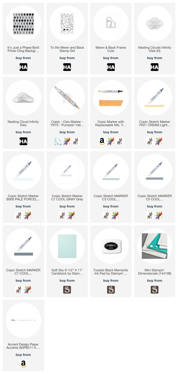
I stamped the "It's Just a Phase" moon phase background stamp in black on white cardstock. (everything on this card is an add-on so it won't sell out).

Then I stamped the cat, mouse, moon and space debris images from To the Mewn and Back on marker paper and colored them with Copics. They have matching dies. I  added them on top of the vellum panel, with an infinity cloud die for the sentiment. I mounted all that on a Soft Sky card base. I LOVE THIS CARD. (I know - repetitive)

What's cool about this month's release is they've added a new cloud infinity die. So the one I used on my card is the existing one - the new one is beautiful - it's listed below the card. The vellum with the little sparkles in it is from a past kit - but I've linked one that looks identical below. MEOW.

 Since you now know I'm an X-Files fan, this next card should make a lot of sense.

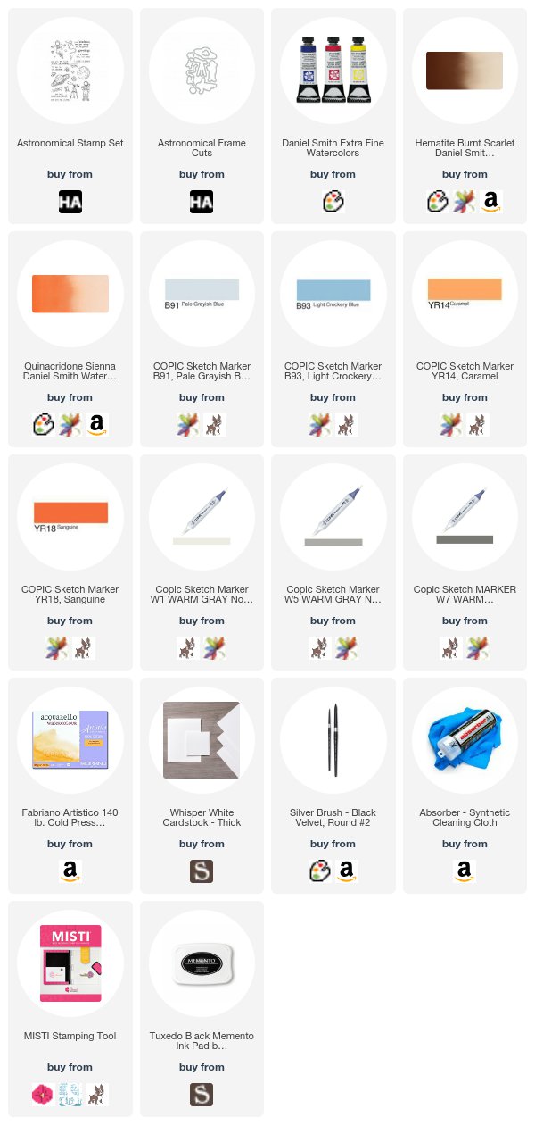
I used another add-on - Astronomical - for my astronaut and sentiments.  This set also comes with matching dies.

What's funny about this card is that it's from the reject pile. I had the top galaxy experiment that had a hard edge at the bottom and I was ready to toss it. Then I noticed that the hard line at the bottom, if it became the horizon line, it looked sort of desert-y. So I added some of my favorite watercolor - Hematite Burnt Scarlet + Quinacridone Sienna to make it look like Mars and all of the sudden it started to make sense. Added my astronaut and had a fun little scene! I LOVE THIS CARD. (See a pattern?) I colored the Astronaut with Copics for a little mixed media diversion.


And here's the one that started it all.

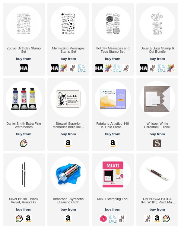
I have a BIG birthday this month, and I'm a Virgo. So when I saw the Zodiac Birthday set I had an idea for a Virgo birthday card. The set includes all the zodiac signs, so I thought I'd put all of them together EXCEPT Virgo and make a scene where the rest of them were saying happy birthday to her :). You know - from her best buds. 

I used a variety of stamp sets to make this happen, and I'm sort of tickled with how I built that greeting from Holiday Messages & Tags, Daisy & Bugs and Mer-mazing Messages. The sentiments are from the sets linked below, thanks to some fun combinations and a little stamp surgery. 

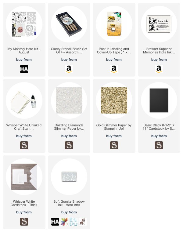
And finally - a beautiful CAS scene from the kit. Now the kit is while supplies last, so do NOT blame me if you don't get one - here's your chance!

For this card, I used the stencil that comes with the kit, with Clarity Stencil Brushes and Soft Granite Ink, as well as the dies to create this sweet scene.  The stencil in this kit is so beautiful - I could see it for baby cards, wedding cards and general cards - it's just timeless. For the little girl die cut, I just lightly brushed white ink on the left side of the cut to make her look like she was lit up by the moon and the stars and the light was falling on her. This is one of my fave techniques with non-stamped die cuts. I cut the stars with the dies in the kit from glimmer paper


I'm hopping with my TALENTED buddies today for this awesome release, so please visit them and comment for your chance to win this kit (or be reimbursed if you already bought it) - by commenting on each blog post. The giveaway closes on August 13th at 11.59 PM PT.

Libby Hickson


Remember, you can enter my August giveaway of an Arkon Pro Live Streaming Stand - the one I film all my tutorials with PLUS a ring light for the perfect lighting awesome selfies and live streams one of two ways:
  • Place an order in my store any time during the month of August for an automatic entry. BONUS - use host code 4BY7YKR7 on your order to be entered in a drawing for free Stampin' Up! products as well! 
  • Comment on the post link right here (read the instructions there) and you'll be automatically entered. If you place an order in my store AND comment on that post, you'll receive two entries!
And remember - you can always use my code - UNDERSTANDBLUE - at Arkon for 20% off. They sell all sorts of mounts - hands-free phone mounts for the car, GoPro mounts, tripods, you name it. and they are GREAT people and provide great service.

LoveyatotheMEWNandbackmeanitbye.

Sunday, August 6, 2017

Breaking News - about KETCHUP!

During my last retreat, there was great controversy. Since I do not allow news or politics at my retreats, we find other subjects to explore. And late one night, as we were flitting from one topic to the next, the dreaded and highly divisive subject of KETCHUP came up.

That's right. Ketchup. Nearly as divisive as subjects like mayonnaise and Keurig, ketchup conversations usually devolve into yelling and a high level of distrust for one another. This was no different.

The beginning of this story is contained in a confession from a prior retreat from my friend Dana that she hated ketchup. Not knowing that I was going to be destroying her entire universe, I told her she did not, in fact, hate ketchup, because the "fry sauce" at her beloved Raising Cane's is made with ketchup as is the "fry sauce" everywhere else in the free world. You would have thought I'd told her she had to spend three hours in a porta-potty. You could see her remembering eating this now hated substance willingly and innocently, while trying to remove her tongue with her mind. She was crushed. I didn't reveal that many, many foods, like BBQ sauce and a lot of asian sauces start with her mortal nightshade enemy sauce.

So this raw wound was opened at this retreat again, as the attendees started to discuss (and by that I mean yell about) the various applications where ketchup was and was not acceptable. Shouts of DENIED would follow anyone's terrible ketchup suggestions. Here's a short list:
  • Hot Dogs - ketchup is DENIED
  • Eggs - ketchup is DENIED
  • Steak - ketchup is DENIED - what the heck is wrong with you? This is why we can't have nice things.
  • Hamburgers - there were mixed feelings on this, mostly because of Wendy's and McDonalds. 
  • French fries - allowed, but only if you DIP, not pour ketchup all over your french fries like some kind of animal.
  • BBQ sauce - it's an essential ingredient, but if you have a ketchup-induced mental illness of some sort, you may tell yourself that it's tomato paste, vinegar and sugar instead. 
It was hysterically funny. Throughout the weekend, little packets of Whataburger ketchup (God's one true ketchup) would appear in Dana's crafty space and we'd hear her animated BWAHAHAHing.

Then yesterday - my friend Meg - God bless her little eyes - she posted a picture of EGGS sitting on top of JELLY that she was eating.

DENIED Meg. Eggs and jelly do NOT go together. 

However, through the hilarious comment thread that ensued, I realized something that makes everything  ketchup-related make sense. A shocking revelation.

ketchup is tomato jelly.

It is. You make ketchup the exact same way you make jelly. Add a fruit, some sugar, and something acidic. Boil it down. Stick it in a jar. Eat it on stuff.

You're welcome for me solving this case. It also PROVES beyond a shadow of a doubt, that jelly does NOT go on eggs. Not the tomato kind or any other kind. Neither does jelly belong on hot dogs or steaks.

Now speaking of tomato jelly - I just want to point you towards one of my favorite recipes - my yellow tomato jam I make with my homegrown tomatoes. Jam is a different process than jelly, so this is not a jar of ketchup. It's delicious.

So I made a card to calm you all down after that condiment controversy. I know you need to breathe.


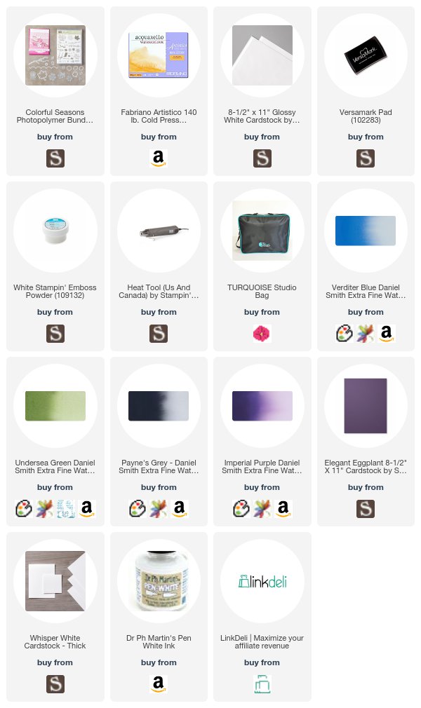
Colorful Seasons is one of my favorite bundles! My grandparents had Adirondack chairs on their beautiful screened porch that looked out over Chesapeake Bay. I loved that house. And I love this die so much. It makes such peaceful cards.

I just did a watercolor galaxy background, and spattered it with pen white ink. The sentiment from the set is embossed with white embossing powder. Then I mounted it on Elegant Eggplant cardstock and put it on a white card base. You can't see it here, but the chair is cut from glossy cardstock, so it's shiny like a painted chair like my grandparents had. The specific Daniel Smith Watercolors I used are: Undersea Green, Payne's Grey, Verditer Blue and Imperial Purple (linked above).

This was fun and easy to make. It's good to have a card like this on hand for when someone's ketchup anxiety takes hold. It happens more often than you think.

IMPORTANT NEWS!! The MISTI Studio bag introductory price
ends tomorrow so get yours while it's on sale here


Remember, you can enter my August giveaway of an Arkon Pro Live Streaming Stand - the one I film all my tutorials with PLUS a ring light for the perfect lighting awesome selfies and live streams one of two ways:
  • Place an order in my store any time during the month of August for an automatic entry. BONUS - use host code 4BY7YKR7 on your order to be entered in a drawing for free Stampin' Up! products as well! 
  • Comment on the post link right here (read the instructions there) and you'll be automatically entered. If you place an order in my store AND comment on that post, you'll receive two entries!
And remember - you can always use my code - UNDERSTANDBLUE - at Arkon for 20% off. They sell all sorts of mounts - hands-free phone mounts for the car, GoPro mounts, tripods, you name it. and they are GREAT people and provide great service.

Loveyameanitbye.

Friday, August 4, 2017

Back in Black

I've finally settled on why I hate red and green together. I am not a grinch, I promise. It's just that except in nature, I find the color combo revolting. I've written about this before.

It's because red is not a primary color. Neither is green. Which is why Tempting Turquoise and Daffodil Delight and Melon Mambo are my Holy Trinity and always play well together.

But that's just a side note. More on that in an upcoming Gel Press video.

Because the real reason we are here today is the GLORIOUS Christmas combination of black and white.

My holiday mini pre-order arrived yesterday and with it, SO MUCH black and white goodness. Wait until you see the music designer series paper - JUST WAIT.

But even in the regular catalog, there are some beautiful black & white products. For years, we had black and vanilla, which is not appealing to me at all. I love the crispness of the ultimate contrast. So I'm in a Christmas mood today.

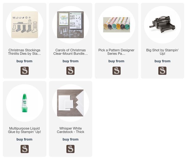
We made this card at my class on Saturday and I love it. The deer and trees are from the Carols of Christmas bundle. LOOK AT THAT DEER. LOOK AT HIM. The Noel is from the Christmas Stockings Thinlits. The paper is not a Christmas paper, but I thought the pattern looked like stars and snow. It's listed below - might surprise you.
Black and White Christmas by UnderstandBlue

The perfect Christmas color combo. Elegant, classy and sort of quiet. Like know falling on a tiny deer in the woods. :)

Remember, you can enter my August giveaway of an Arkon Pro Live Streaming Stand - the one I film all my tutorials with PLUS a ring light for the perfect lighting awesome selfies and live streams one of two ways:
  • Place an order in my store any time during the month of August for an automatic entry. BONUS - use host code 4BY7YKR7 on your order to be entered in a drawing for free Stampin' Up! products as well! 
  • Comment on the post link right here (read the instructions there) and you'll be automatically entered. If you place an order in my store AND comment on that post, you'll receive two entries!
And remember - you can always use my code - UNDERSTANDBLUE - at Arkon for 20% off. They sell all sorts of mounts - hands-free phone mounts for the car, GoPro mounts, tripods, you name it. and they are GREAT people and provide great service.

Don't forget to check out Dare to Get Dirty - you have till the 9th to upload, and the inspiration is amazing. This card is for my challenge today, which is the last one, and it's awesome. If you want to see the Pinterest boards - here are the challenge host samples and here are the Host Favorites - so each challenge host picks their favorites from the gallery entries for their challenge. Prepare to have pretty things all up in your eyeballs. You're welcome.

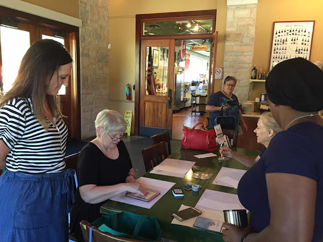
Oh - and speaking of my class this weekend - we had a celebrity guest - one of the sweetest people on earth - Shannon West. So I'm closing out an AWESOME week today. Hope you are too.

Shannon West, Lydia Fiedler, Caron Bailey

Shannon West at Understand Blue class

Shannon West at Understand Blue class


Loveyameanitbye.

Thursday, August 3, 2017

Hug Me (& My Clan)

I love the idea of clan tartans.

It's like Scotland had the idea for Star Bellied Sneetches before Dr. Seuss was a gleam in anyone's eye.

You can put on your skirt kilt and run down to have some haggis with your boys and instantly know your other clan members by THEIR skirts. It's pretty ingenious. Of course, it's just fabric, so if someone really wanted to pull a shenanigan they could just make themselves any skirt they wanted and blend right in. That is, if they were crazy enough to eat haggis.

I'd personally design a brand new tartan if any of MY clan ate haggis. I'd have to start fresh with new clannies. SORRY CLANNIES WE ARE NOT EATING STOMACHS. NO. DENIED.

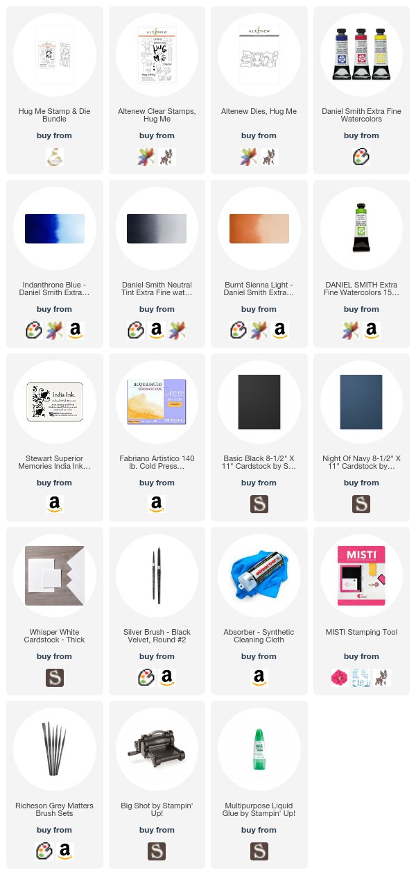
I decided to watercolor my mom's dad's clan tartan for my card today. This is actually not an easy task. I thought I'd just look it up and paint a few stripes and be done. But ours is blue (of course) and black, and so mixing it was tricky, and then it doesn't really LOOK like a tartan until you add those teeny diagonal hashies, which was a lot of work and hard to make even. I LOVE my teeny brush - it's a 2/0 Grey Matters (brushes linked below) and I can get such fine detail with it. But it is hand painted, and it doesn't have to be perfect, right? At least that's what the fox says :).
Hug me Bundle - Altenew by Understand Blue


Isn't he the cutest? I love that the die cuts him and his sentiment out. Adorable.

Now - I want to announce the winner of my JULY Arkon giveaway!!

julie archer - you are my winner!

You can enter my August giveaway of an Arkon Pro Live Streaming Stand - the one I film all my tutorials with PLUS a ring light for the perfect lighting awesome selfies and live streams one of two ways:
  • Place an order in my store any time during the month of August for an automatic entry. BONUS - use host code 4BY7YKR7 on your order to be entered in a drawing for free Stampin' Up! products as well! 
  • Comment on the post link right here (read the instructions there) and you'll be automatically entered. If you place an order in my store AND comment on that post, you'll receive two entries!
And remember - you can always use my code - UNDERSTANDBLUE - at Arkon for 20% off. They sell all sorts of mounts - hands-free phone mounts for the car, GoPro mounts, tripods, you name it. and they are GREAT people and provide great service.

Don't forget to check out Dare to Get Dirty - you have till the 9th to upload, and the inspiration is amazing. This card is for Jean - naturecoastcrafter - Cross' challenge and it's awesome. If you want to see the Pinterest boards - here are the challenge host samples and here are the Host Favorites - so each challenge host picks their favorites from the gallery entries for their challenge. Prepare to have pretty things all up in your eyeballs. You're welcome.

LoveyameanitbackwithaChristmascardtomorrowbye.

Wednesday, August 2, 2017

The Long Journey to This card

This card has one of the longest backstories EVER.

Here goes.

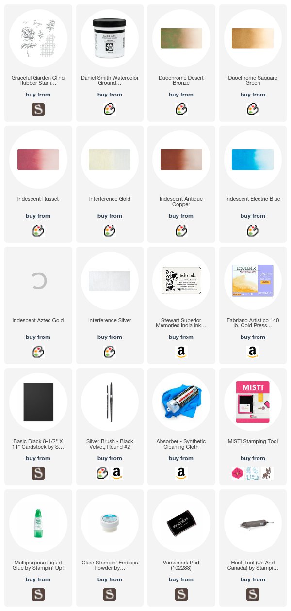
In February of this year Lori Craig and I decided to split some Daniel Smith watercolor. She had just finished a great online watercolor class, and I had just signed up for it, and we wanted an economical way to get a really pretty landscape appropriate set of watercolor.

Little did we know that that would open the door to what is now a large Facebook group, nearly 6,000 half pans of watercolor and the worst communal case of Full Set Syndrome the world has ever seen.

On our way to splitting a full set of Daniel Smith with many wonderful friends, we learned a ton, got involved with World Watercolor Month, painted some pretty things and generally had a good time.

Each split is about $100 and had 25-30 colors in it. Each tube is split 5 ways, so it's a really inexpensive way to acquire these amazing, artist-quality paints that none of us could have afforded on our own. Goes to show you what can happen when smart people get together. If you're interested in joining the group, you can submit a join request.

Well the very last split was for the Iridescent group of DS watercolor. We were all dying to get our hands on these. So shimmery and beautiful. These are lower priced than the traditional watercolors in his line, so we did a larger split that had the complete line - more than 40 colors.

Fast forward to June. The original splits were all complete - I had squeezed paint into nearly 6,000 little plastic half pans, cured them and shipped them out, and I was on my way to Santa Fe, watercolors in tow. I went to my favorite art supply store that I save up to visit every year and splurge on fun new supplies, and I just had one "must have" on my list - a black watercolor ground. ANNNNDDDD they didn't have it. Oddly enough, they had other grounds in his line, but didn't even know that he had one. So I had to order it when I got home.

BUT THEN - I still couldn't post the card I made with it because it's for a Dare to Get Dirty challenge, which is this week.

So this card took 6 months to make!!! And possibly eighty billion dollars and 2,000 hours if you add up all the time and money involved in the splits. BUT IT'S REALLY PRETTY!


So a watercolor ground (linked above) is just a medium that makes a surface watercolor friendly. It's sort of like gesso for watercolor. Daniel Smith makes several, including this black, but also shimmery grounds which I'll show you soon - they are beautiful. So you can use the gold and pearl shimmery grounds under traditional watercolor for a different type of look than my black ground with the shimmery watercolor.

Seriously, there is no end to fun stuff in this world.

I'm super excited for the holiday mini catalog pre-order that should be here in a few hours! You'll just DIE when you see peeks. Well not really. The peeks won't ACTUALLY kill you. That wouldn't be very nice of me. But you WILL love them.

Don't forget my August Arkon giveaway has begun! You can enter now - instructions in this post!

Now go make something sparkle!

Loveyameanitbye.

Tuesday, August 1, 2017

Sorry For Everything (+ New Giveaway)

One of my favorite sets in the current catalog is actually a type of set I don't typically buy - and that's a sympathy set.

The sentiments don't always feel right to me - and that's really just because I never really know what to say when something bad happens.

The other day I came across a woman who is a cancer survivor, and I read the article about her, and realized that just because you don't know what to say, that doesn't mean you shouldn't say anything. I think you'll enjoy her story and her frank cards. (Warning - there is some explicit language there.)

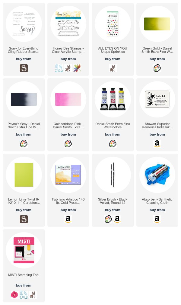
But this year, I found a sympathy set that I ADORE. It's called Sorry for Everything, and it has this HUGE Sorry and then a bunch of matching sentiments. Stay tuned for some hilarious cards with this set soon. (One in particular cracks me up, but it won't be up for a few weeks.)

So the first time I inked it up, I could not resist pairing it with a green, ill little Blah Bunny and my favorite eye stickers from this post.
Sorry For Everything with Blah Bunny by Understand Blue

Isn't that watercolor a perfect match for Lemon Lime Twist? Love it.

That bunny KILLS me. How you can be THAT cute when you are THAT sick is beyond me!

Two important things - the introductory price on the MISTI Studio bag is ending on August 4th, so if you haven't gotten one - do it now here!

Next - my August Arkon giveaway begins TODAY!! To be entered for August's drawing for an Arkon Streaming Video stand plus a ring light, leave a comment on this post that includes the phrase "I want to win Lydia's Arkon package for August." And remember - you can always use my code UNDERSTANDBLUE on the Arkon site for 20% off any time.

I lied - THREE things! The pre-order for the BEAUTIFUL holiday mini catalog starts today! If  you purchase the starter bundle this month, you can fill it with these preorder beauties at a huge discount and with free shipping! I'll be peeking some goodies when they arrive. I set my alarm for 4 AM today to get my order in!

Have an awesome Tuesday!

Loveyameanitbye.
Related Posts Plugin for WordPress, Blogger...