
It was a hot pink and dark purple combo, and she found bedspreads that were the same dark purple. We thought it was perfection. It had wild, bold and very 70s imagery on it, although now I can't remember what the images were, but I remember the colors vividly.
So that's what inspired today's watercolored image, along with my absolute FAVE Christmas color combination, which is not red and green, as you know, but pink and green instead. It's that little shift that makes seasonal cards more interesting than the classics.
This large poinsettia image is stunning. It's the collaboration set for Stamptember with Gina K Designs and it's just amazing. I spent a few hours taking a break from worrying about the Bahamas and just got lost in painting this image.
I used the same process I use pretty much every time I paint a floral. I painted the foliage first, being sure to add a little of the pink and the purple I use in the main image to tie it all together.
Then I painted a single petal at a time, moving to a new dry area while one petal dried. I never paint adjacent petals, which does two things: 1) watercolor follows water, so this way my paint doesn't escape the one petal I'm painting and 2) it make each petal look unique, because it's like a bunch of little separate paintings - each one with a different amount of paint and water.
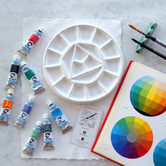
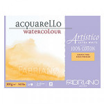
When the whole thing is done, I go back and add the darkest details - using the same purple to add shadows and give it dimension. I only used a few pigments on this image, even though it looks very colorful. I used: Terra Verte, Rich Green Gold, Opera Pink, Carbazole Violet, Indian Yellow and Phthalo Turquoise. The sentiments are big and FABULOUS. I painting this on Fabriano Cold Press with Escoda Versatil travel brushes, plus one Versatil detail brush. The sentiment is Nocturne. I stamped the image in Fadeout Ink to give it a soft, no-line look.

Since this is a collaboration with two of my favorite humans, it's extra special. But now I have to decide which one gets this Christmas card! EEK.
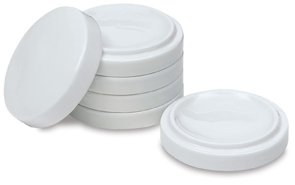
Hope you like it! I finally pulled out my new ceramic palette for this painting session - this woman makes such gorgeous palettes and this is her latest.
Hope you like it! I finally pulled out my new ceramic palette for this painting session - this woman makes such gorgeous palettes and this is her latest.


|


Loveyameanitbye.


This is absolutely Beautiful and I just ordered it.
ReplyDeleteI LOVE this, Lydia! Such a beautiful mix of colors.
ReplyDeleteUnbelievably gorgeous
ReplyDeleteUm.... this is just pure JOY! You amaze me!
ReplyDeletegorgeous card mf...I sure wish I was better at watercolouring.
ReplyDeletexx Karen