
We have something in common, which she talks about a lot - and that is a compulsion to just keep working on coloring projects endlessly. Like - until everyone in the house is starving to death and we forget to pay the light bill.
I don't know if that's a style thing, or if it's just a personality quirk, but we both have it pretty bad.
But what I will tell you about this compulsion is that a LOT of times, my project looks horrid at some point in the journey I go on, but my patience to just keep working pays off 99.9% of the time. I know the word patience can be a bad word, but in coloring/painting, it can end up not just paying off, but giving you hours of relaxing, peaceful activity.
Years ago, I would have tossed things that weren't going my way. But I've learned that shading, blending and a simple black pen can bring most things back from the brink - and often, they turn out even prettier than I intended them to, when I started down what was supposed to be a simple road, and ended up being a five hour multi-medium odyssey.
Such is the case with today's project.
I started with this stunning stained glass image from Craft Stash in the UK. They have several images like this in this beautiful collection, and I want them all. Their prices are great, even though your packages might come from far away in the US, and you can click once to switch to US currency to shop. Inside the UK, they ship free.
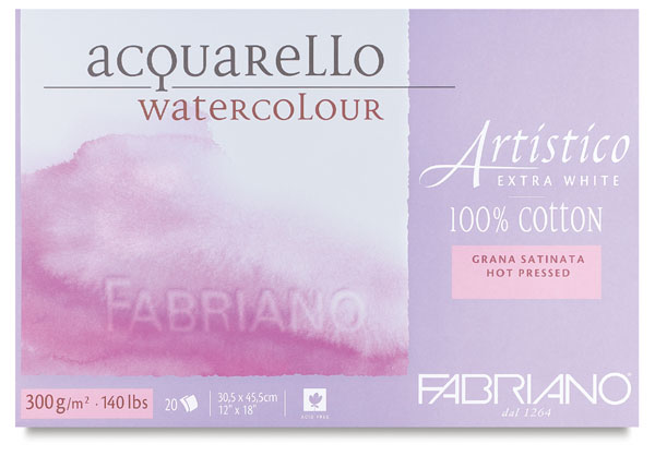
First, I embossed the image on hot press watercolor paper with platinum embossing powder. That's sort of a warm silver color, if that makes sense. I used the Inkon3 Embossing ink. This is a very well-inked pad, but what I like about it is the foam is firm - even firmer than a normal foam ink pad, more like a felt/linen pad - and so it doesn't make a mess of your stamps.
Then I picked a handful of my favorite Tombow Markers (N65, 725, N57, 925, 173, 055) and started to color. The blue and yellow were easy, and that's what I started with.
But then I added the bright orange and pink on the curved space and it was CRAZY bright. Like fluorescent almost, and not super harmonious. But I kept going - picking out the colors for the band around the edge and working my way through it. I was listening to the Dirty John podcast at the time, so I was pretty riveted. (The list of my favorite podcasts is here.)
When I was done adding color, it was just too bright. So I started adding this grey as a shadow here and there, and it instantly improved the overall look. But the orange in the circles was still too bright, so I actually took the pink marker and colored over the orange and shaded them with grey, and that fixed my color issue. Now it was looking like vivid stained glass. But it still needed something, and I had lots of podcast ahead of me, so I decided I'd add some details with my teeny Micron pen. Black pen makes everything better.
First, I flicked little lines in the flower petals - BOOM. I liked that a lot. So I did that to the vase. Oh yeah. Now I was in a groove. Then I decided I loved the way the pen made the vase look so crisp, so I decided to outline the triangles.
Well when I saw how amazing THAT looked, I knew I was committed to outlining every single colored area. I'm crazy like that.
Yes, I finished the podcast during this card, but man am I glad I did. I LOVE how sharp and crisp this is when it's all said and done. If you think about the way stained glass really looks, the lead is raised, so right next to the lead it really is very dark right next to it, and so it ended up looking very dimensional and realistic. And the colors are so saturated and pretty, it does look illuminated, especially on a black card. I went back and forth between white and black, and had to get some outside votes, but it definitely belongs on the black.

|


So check out these beautiful images, and most importantly - don't give up on coloring projects. When Kathy was here for her coloring challenge on the road event, a sweet student in the class brought me her watercolor project and let me add to it. I worked on it all day in between teaching sessions, and here is the before and after of a painting she wanted to throw in the trash. We all learned so much. It's more about patience than skill. And if you have the patience, you will get the skill. I included this stamp image in the supply list above.

Hope you have a great weekend lined up. I'm off to a retreat next week, so check out Facebook and Instagram for shenanigans and I'm sure lots of bacon photos.
Loveyameanitbye.


Absolutely stunning! I love watching Kathy color - she is amazing! You definitely both have infinitely more patience than I have. But I think it's also about knowing what to add to take your coloring from the "before" to the "after" I don't have that either!
ReplyDeleteMany of the old stained glass windows have black accents like you did on the flowers. The window turned out beautifully. I believe you are right that you need to have patience and also the willingness to experiment.
ReplyDeleteBrightened my day with your beautiful colors!
ReplyDeleteThat is a stunning stained glass creation! The colors you ended up with are beautiful, and the fine black lines are a perfect finishing touch. Now I must go check out your tip on the the stained glass images, because I need some new ones.
ReplyDeleteOh, and I forgot to mention in my previous comment..... I love the before and after watercolor photos!
ReplyDeleteI always chuckle when watching a Kathy video, she freely admits her can't stop compulsion, but if it ain't broke, well you know. That stained glass is SO pretty!
ReplyDeleteOh, shut the door! I mean the window! I stared at this and saw the painstaking detail work you added with the micron pen. It's amazing. PS, I think I broke the nibs off my smallest microns soon after buying them years back. It's like they are very delicate or I am extra rough on them. Thank you for the beauty ♥
ReplyDeleteWow! I learn something new everytime I see your work.The embossing makes it look so much more authentic. It's beautiful, and I also love the other stamp set. Thank you!
ReplyDelete