*Compensated affiliate links used where possible at zero cost to you. No posts are ever sponsored or paid.*
I am not a person who reads instructions. You know this about me.
This is true in every part of my life - stamping is no exception.
I don't watch many videos or tutorials, because I don't want to be influenced by someone else's design style. I will seek out a video if I'm trying to learn something technical, but I really try to shield myself when I'm creating.
So what that means is I do a LOT of things wrong!
And you know what - sometimes that means I can create something other than what the artist intended.
So I have committed two offenses against the artist behind the first stamp set I'm using today, both of which amused us, one of which was an accident, and they both turned out to be cool in the end!
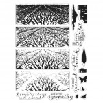
First - when I looked at this stunning layering lavender set, even though I knew it was supposed to be lavender, my prairie loving bird brain saw a field of wheat. So I ventured out on my own and tried what was in my head and I LOVE it as wheat!!! I used my Life Changing Blender Brushes to make a beautiful blue sky with Indigo and Ocean inks, and then I positioned what in my head was an empty barn from the same set on the right, letting the light shine through onto the field with the help of a white gel pen. The inks I used for the wheat are: Soft Vanilla, Cup o Joe, Pumpkin Pie and Soft Brown. I created the barn shadow with a warm grey Copic.
I thought the whole thing had an Andrew Wyeth look. Maybe that was the little arty angel sitting on my shoulder.
Now when I went to Creativation, I helped Libby with an event before the show and she asked me to use that same set with their new Hero Hues pigment inks, and I had an idea to layer the Amethyst ink with Unicorn ink to lighten it up and get multiple shades from one ink pad. Now keep in mind, when we are working on catalog products for the show we usually get a prototype set, often without the index sheet with the printed images and haven't seen any samples yet, so remember that when I tell you what I did and give me some grace.
Sorry for the terrible cell phone pic, but this is what I texted her:
We both loved the layering of the inks with white to change their color, BUT we later learned I had done the image backwards - put the purple where the green should be, and the green where the purple should be!! We got a good cackle out of that, and so did the designer!
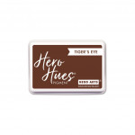
But at the end of the day - it looks great both ways - one field just has more lavender than the other! The lesson is, of the new layering scenes, this is an incredibly versatile one! Inks used here: Emerald, Amethyst, Unicorn, Tiger's Eye.
The others are just as lovely, and I think the sentiments are incredibly well matched! I LOVE the name for this series of stamp sets - HeroScapes.
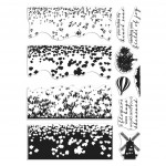
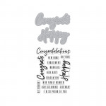
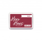
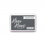
This is the tulip set, and it's so timeless - I think it could pass for poppies as well - but it contains a beautiful Dutch windmill image too. I used this beautiful little Congrats word stamp and die (it comes with a Happy stamp and die too), and the sentiment is from the same set. Inks used here: Red Royal, Lime, Forever Green, Moonstone.
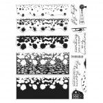
Now I think I've told you this before, but my great grandmother lived for a time on a relative's farm in North Dakota, with a ginormous sunflower crop. She was a fantastic needle worker, and she would embroider pillowcases, etc. like a lot of women did then, but I remember one fantastic piece of embroidery she did in sort of a Van Gogh style, of the sunflower fields with the crows rising up off them. I'm not sure where this piece is now - I'd love to see it again.
Anyway, that is what this beautiful layering sunflower scene brought to mind, so I recreated what I remember. Inks used here: Tangerine, Lemon, Lime, Forever Green, Moonstone.
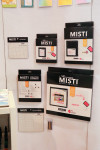
These are all so much fun to use and such a fun new style for Hero Arts. They were definitely creating a buzz at the show! Extremely easy to align, and though extremely colorful and detailed, they are also naturally suited to clean & simple cards - my favorite.You know what else created a buzz at the show? The new black, Hero Arts branded MISTI! It's SO cool and sharp looking and people were freaking out about how great the black looks. It comes in all three sizes. It will show out of stock on the site, but you can sign up to be notified - it should be in around March 15th. Here's a sneak peek!
I have all the ink colors I used today listed again below, including the new Hero Hues - I listed the full line of colors, and if you want to grab their latest catalog - you might see some familiar cards in there - you can do so here.
And the rest of the new releases revealed at the show can be found here!
|
And as usual, there's more inspiration for you from the Hero team & guests below - and leave me a comment for your chance to win one of three $50 shopping sprees! The winners will be announced on the Hero Arts blog - leave your comment by February 19th.
Loveyameanitbye.









Wowza!! Those fields are stunning! Your happy accident simply showed how versatile they are. Your reverse piece reminded me of Wizard of Oz.
ReplyDeleteI must have the sunflower field for my daughter!
love your ideas!
ReplyDeleteI believe we learn so much from our mistakes... I am so in love with these new Heroscapes. The sunflowers definitely, lavender also. Your take on the sunflower field is so wonderful. Big thanks to your grandmother!
ReplyDeleteLove your cards! They would be great for a gift set to someone special. Thanks for a chance to win and Happy Crafting Everyone!
ReplyDeleteAck! I need them all! Love these cards!
ReplyDeleteLove your cards. The scenic building stamps are great.
ReplyDeleteGreat cards!
ReplyDeleteThese are beautiful! :)
ReplyDeletepretty cards! bold and bright!
ReplyDeleteI loved the wheat field! I, too, like to do the unusual.
ReplyDeleteThose heroscapes stamp sets are really stunning, and I love your cards, especially the twist with the wheat field!
ReplyDeleteI think they all came out wonderful. And the wheat really is fabulous.
ReplyDeleteBeautiful cards, I love seeing how alternative colors change the look of these gorgeous stamp sets.
ReplyDeleteThat lavender field still looks amazing, I love the layer of white. The black MISTI is gorgeous, but my sad old eyes couldn't handle it.
ReplyDeleteI was over the moon happy when I saw the sneak peek of these new HeroScapes! They're ah-may-zing!! Thanks for sharing how to experiment with them, too :)
ReplyDeleteWow - I love your cards. The "wheat field" with the lavender stamp is so cool and just shows - you can make almost anything - just give it a try. I love the sunflowers the best.
ReplyDeleteLove all these landscape backgrounds in your cards. Love the wheat field. Thank you.
ReplyDeleteGreat shadow on the house. Nice touch!
ReplyDeleteOh! I am with you on the prairie! That's probably what I would see. Your lavendar fields are gorgeous and I would have never guessed you reversed the coloring. Fabulous cards!
ReplyDeleteThat is an interesting way to use the stamp. It looks like a wheat field. Brings me back home.
ReplyDeleteBeautiful creations!
ReplyDeletestunning cards - love the gorgeous sky you created on the first card !!
ReplyDeleteLOL...I love the wheat field! Gorgeous sky background. Awesome cards.
ReplyDeleteThose are beautiful, I love these new stamp sets.
ReplyDeleteAbsolutely stunning landscapes and skies!
ReplyDeleteBeautiful sky and wheat. You're right about it looking like and Andrew Wyeth. I can all most see Christine out in the field.
ReplyDeleteThey are all wonderful. The brighter days are ahead is so needed...
ReplyDeleteSo creative.
ReplyDeleteWell..first of all...I have to say that your post is hilarious! And second...I was thinking of wheat when I saw the lavender field also! Third...I actually like the look of it backwards rather than forward!! Awesome cards!
ReplyDeleteAwesome creations! I love them all, I definitely saw wheat when I saw the first card!
ReplyDeleteyep ... might just need another MISTI
ReplyDeleteYour lavender blooper sounds exactly what I would do. And you're right. It works.
ReplyDeleteI knew it was wheat the minute I saw it, loved it, never thinking it was the lavender scape stamp. Genius. I love your thought process and all your design creations!
ReplyDeleteI like the sunflowers and how you turned the lavender into wheat - it really does look like a field of wheat.
ReplyDeleteLove the beautiful cards and various colour combinations. "Accidents" what accidents? Just creative way to use the stamp sets to get different looks, love, love, love!! Hoping your weekend is fabulous. Cheers Donna Z :)
ReplyDeleteYour cards are wonderful, Lydia! The flower field cards are so effective with the colour layering! Thanks so much for the inspiration!
ReplyDeleteBeautiful cards!! Love the scene that you built, so pretty!
ReplyDeleteThese are lovely, unique stamp sets and cards. Thanks for sharing about how you made them.
ReplyDeleteI like the happy accidents of the field stamps. It's a great way to show that the stamp can work in other ways. I was wondering myself if the flowers could be changed to show less.
ReplyDeleteBeautiful cards and beautiful layering stamps. I’m very intrigued by these! Love how you showed their versatility!
ReplyDeleteThese are such gorgeous cards. The wheat is too brilliant, that barn idea SO sweet. All your cards here are stunning. P.S. I don't think I can survive the wait till the 15th of March for that black Misti. I have issues with being a neutral freak & though I bought new white tape for my misti it's an original one with the pink graph vinyl sticker front intead of the etching. I even sent a pesky email to ask if they sold new neutral vinyl sheets lol. Time for a sleek new upgrade! You made my month.
ReplyDeleteBeautiful cards!
ReplyDeleteI love how the Heroscapes are so conducive to embracing the white space. The resulting cards are simple and spectacular.
ReplyDeleteI really like your lavender fields as a wheat field. I live in a rural area where wheat is grown here, so I identify more with wheat than lavender. The sunflowers are my favorite, as it's also seen here.
ReplyDeleteLove the lavender fields.
ReplyDeleteVisited a lavender farm a few
years ago and bought some of
the wonderful soaps they had.
The cards are fantastic.
the house in the field is great.
thanks for sharing
txmlhl(at)yahoo(dot)com
Love these beautiful scenes you have created!
ReplyDeleteI LOVE your lavender field as a wheat field! What a why to come up with something completely new! I love lavender, but the unique twist to your card is inspiring!
ReplyDeleteSuch beautiful landscape cards! Love the colors.
ReplyDeleteThanks so much for sharing.
I love it all. I know that wheat grows over my head but I still buy it as some kind of crop! I am wondering what the tulips would look like in rows of colors like they are in the fields there...and I totally love the sunflower story! I wish she could see your card.
ReplyDeleteThere was an interesting comment made about embracing the white...I can have trouble with too much white but I agree. This is so color dense that the white balances well.
hugs Margot
Your cards are absolutely gorgeous. Beautiful colors. I love the HeroScapes sets.
ReplyDeleteThe Heroscapes sets are my favorite from the new catalog and your cards are lovely!!
ReplyDeleteI love the wheat field and the shadow cast by the barn!
ReplyDeleteFantastic cards; thank you for the inspiration. I'm loving the layering scenes stamps.
ReplyDeleteLove them all, backwards or not! Great idea to try something new, Thanks!
ReplyDeleteLove your cards and your great story! These HeroScapes are so cool, and I think your wheat field is incredible.
ReplyDeleteThis was a fun post and your cards turned out beautifully.
ReplyDeletelove these scenes and how you turned lavender into wheat.
ReplyDeleteWow, these new stamps create the most beautiful scenes!
ReplyDeleteLovely work Lydia!
ReplyDeleteStunning cards. Your idea to create fields of different plants is wonderful, and makes these stamps more useful.
ReplyDeleteThey say beauty is in the eye of the beholder and you saw the beauty in the stamp sets a little differently than the designer intended but still you created a beautiful image and your field of wheat card is wonderful. Your reverse colored image is also quite nice and maybe represents a field earlier in the season. thank you for sharing your talent and creativity.
ReplyDeleteShielding yourself from videos etc seems to work very well for you! Love that you came up with a field of wheat!! Beautiful cards all of them!!
ReplyDeleteThese are stunning!
ReplyDeleteThanks for showing us different ways to use the stamps. You are very creative.
ReplyDeleteYour happy accidents turned out amazing, as I'm sure you know! Great post and cards :) I'm really excited about these Heroscapes.
ReplyDeleteI truly love the inspiration. Good job!
ReplyDeleteLove, love the sunflowers! It is so vibrant and absolutely gorgeous!!!
ReplyDeleteThere are never mistakes in stamping. I liked seeing the backwards lavender. It's great too!
ReplyDeleteI love how your mistakes turned into stunning pieces of Art! That is what Art is all about, playing, experminting, going your own way! Love the lavender/wheat!! :o)
ReplyDeleteBeautiful landscapes!!
ReplyDeleteJust love all the delightful Heroscapes products, they make fabulous cards!
ReplyDeleteThe Heroscapes line is just amazing! And I love your "happy accident"--it looks great to me, especially the wheat fields.
ReplyDeleteThanks for sharing your lovely "mistakes". I must admit that I'm not partial to wheat, as I MUST live gluten free. But I still think both your cards are beautiful.
ReplyDeleteI love them all, Lydia!! The lavender fields look fabulous as wheat & really fit well here in Nebraska. I NEED that stamp set!!
ReplyDeleteLove the wheat card!
ReplyDeleteBeautiful and creative! I love that you put your own spin on your designs. Gorgeous cards!
ReplyDeleteThe sunflowers are my favorite!
ReplyDeleteLove your interpretations of the color layering stamps. I'm with you on the wheat idea. I'm from North Dakota and my family produced a lot of wheat over the years! Now I live in North Carolina but my heart is always back in the golden fields of wheat, the blazing fields of orange sunflowers and the calming blue flax fields. That's what I see in these stamps. TFS and for the chance to win.
ReplyDeleteGorgeous cards Lydia. Those HeroScrape images are amazing! Great layers! I love the sunflowers the most. :) Pretty colors!
ReplyDeleteLove these new heroscapes sets. Such a great idea to use the lavender for wheat fields!
ReplyDeleteVery creative! Love the switch from lavender to wheat. The colors you used are amazing.
ReplyDeleteSuch cool cards! These scenes are amazing!
ReplyDeleteLove how you stamped the scene backwards! It is still beautiful! I thought I was the only one that made those kinds of mistakes! :-)
ReplyDeleteFantastic cards! I love the wheat field!
ReplyDeleteI have seen thousands of wheat fields while biking through Holland last summer. I thought I loved the Tulip Heroscapes and now I can't decide because you showed me the versatility. Either way, I sure hope Hero Arts keeps making these Heroscapes because I adore them all, just can't afford them all! Thank you so much for sharing.
ReplyDeleteAwesome scenes!
ReplyDeleteThese are all fantastic. Honestly, I really like your "backwards" field stamping. Makes it more like a young field that just hasn't fully bloomed yet....perfectly Spring ;-)
ReplyDeleteThanks for sharing all your creative cards. I like that you just let your creative self go at it and not let other things influence you to much. The sunflowers is the set that keeps catching my eye.
ReplyDeleteWhat wonderful cards, I love the scenes you have created, brilliantly stamping too.
ReplyDeleteValerija xx
so beautiful!
ReplyDeleteBeautiful cards!!
ReplyDeleteSometimes when we use things not as they are intended we create amazing new things and I don't think this means we did it wrong - just added our own twist! I love your creations and always enjoy your dialog that goes with each piece! Thanks for sharing!
ReplyDeleteSuch delightful cards!
ReplyDelete