I'm super happy that the spring stamping season is upon us. I look forward to the floral releases when we are still suffering the indignities of winter. I realize that I'm not allowed to complain about our tiny winter, but I do what I want. I am not a fan of rain or grey skies, which is what our winter is primarily made up of.
So when I start seeing poppies and roses and daisies, I rejoice. Today is no exception.
Poppies are my favorite. They're so BOLD and different. Our Natural Gardener store's property is covered with poppies - it's the first thing you see when you come around the last curve to the business. It makes me happy. I really need to try to grow them - for some reason they intimidate me.
But they do NOT intimidate me on paper - not even a little bit.
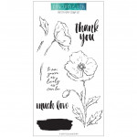
I spent some quality time with a clipboard and this stunning new poppy image - it's nearly card front sized, so that makes watercolor dreamy. I actually only used four pigments for this - all out of the "Lydia" split in my Daniel Smith split group on Facebook. It's a hand-selected split of the Daniel Smith colors I use most. If you are interested in purchasing a split (splitting the tubes among several people to make them less expensive) request to join here. Be sure and answer the questions!
Anyway - I find that you can do a LOT with 4-6 pigments. For this flower, I used Indian Yellow, Pyrrol Scarlet, Carbazole Violet and Undersea Green. See how I added a bit of the red to the leaves like a reflection? I love doing that. This image was stamped first in Fadeout Ink. I decided it didn't need a sentiment, so I left it as is and mounted it on Kraft cardstock.
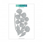
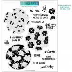
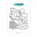
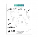
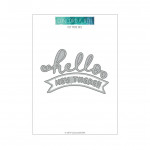
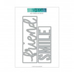
But the die set for this stamp set is PERFECT for loose watercolor - it just cuts the layering shape of the poppy, and so you can paint them all separately and then just assemble them. I paired them with the awesome peek-a-boo sentiment die that's out this month - made to cut a greeting out of the card front, and then on the inside of the card, you can stamp patterns from the matching stamp set, or do what I did here and line the inside of the card with Key Lime Cardstock. I used the same four pigments on this poppy.
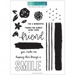
And then, because I can't get enough of Key Lime and Red Hot and Kraft ink together, I stamped this builder image (it has a little orientation tab on each stamp to make lining these up more easily.)
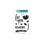
I added the hello die from this turnabout stamp set and die bundle. This is a five minute card, and I LOVE these fill-in sets - they help me make ink be the star of the card.
There are more goodies in this release today that you need to check out. I have them all linked below. I love the critter dies in this set. SO much fun.You can always hit the buy it all button too - my favorite button at Concord & 9th.
All the products I used are linked below - and before I forget - when I published my post yesterday, I forgot to include the discount code for the paint. Click here and use code understandblue3 to get 10% off site wide.

|











Poppies always remind me of my mom, these are lovely.
ReplyDeleteSo in love with this!
ReplyDeleteWho said you can’t complain? Winter is just wrong, and it’s going on toooooo looooonnnngggg! I’ve had enough! I need to see more flowers!
ReplyDeleteI totally agree with you about the drabness of late winter. Damp, rainy and grey weather is terrible for my Sjogrens and Raynauds, not to mention my mood🙄. These projects are so bright and cheerful. I love that about spring, my bulbs start to pop up, the buds start to show and goodbye grey snow piles! Thanks for sharing and have a great day!
ReplyDeleteBeautiful! I am SO TIRED of winter!
ReplyDelete