Monday, July 31, 2017

You're Lucky I'm Snarky (And Blind)

I'm a little behind on playing with some really fun shopping sprees I did a while back.

I love Concord & 9th's "buy it all" button when they have a release. I think they thought I was crazy when I suggested that, but apparently there are a lot of people who are exactly my kind of crazy.

And when I got done making, photographing and uploading the two cards for today, I realized I'm not just crazy, but I'm blind. See if you can see why I say that.

Now being blind is not new to me by any stretch. I've worn glasses since middle school.

But getting older is very complicated for a near sighted person, because you become both near-sighted AND far sighted and so you end up with ten pairs of glasses stacked up on your face, and cervical vertebrae screaming as you try to get your head at just the right angle to see something. You have glasses on your head, on your face, on a chain around your neck, all over your desk. And yet - you never seem to have any at a restaurant. Funny how that works.

But it's also funny how you can see things in a photograph that you miss in real life. I often take pictures of my watercolor in progress with my phone and notice things in the photo that need to be fixed in the painting.

When we sold our first house and were staging it, I took pictures of our kitchen, which was frightfully neat, but only in the photo did I realize the shelf on our island looked messy and needed some stuff removed.

Weird how that works. So take pictures of stuff and spot the mistakes. Or just spot them here on my cards. You know what I say -

perfection is for serial killers

This first card is for Nancy Littrell's Dare to Get Dirty challenge, and I cracked myself up making it. This stamp and die combo has so much potential for sincere cards, but also snarky ones like this.
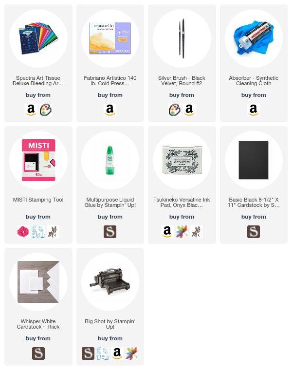
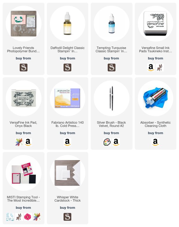
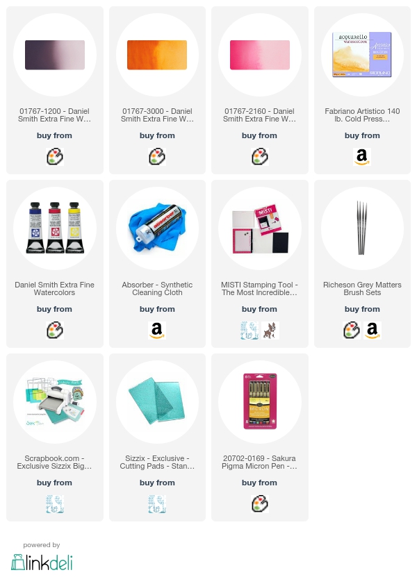
Concord & 9th Lucky Bundle by Understand Blue


Hilarious, right? The background is made with reactive tissue paper, in Magenta, Lemon, and Turquoise. I just wet the watercolor paper, put the tissue paper down, and then went over it with a paintbrush and more water. It has an ink in it that transfers, and just makes another fun way to watercolor. (I refuse to call this product by it's trade name because it sounds like something from the operating room. I wonder how people don't see those names are gross when they are marketing them. But that's a blog post for another day.)

I liked playing with this so much, I had to make several, this second time with a more sincere message, and also including a mistake. Although the last one had two, so I guess I was improving.

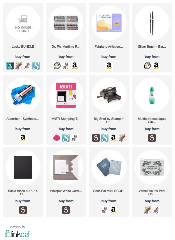
For this background, I used Dr. Ph Martin's Radiant Liquid Watercolor, and just did a wash with a few drops of yellow. Those are such concentrated and vivid watercolors - I just love them. Plus the bottles are beautiful. If you've seen Kristina Werner's videos she has shelves around her room with the bottles of liquid watercolor and they are gorgeous.
Concord & 9th Lucky Bundle by Understand Blue


That card is for Marg's challenge, which is today. I cannot believe July is over!! EEK!

But I am feeling lucky that you are here today - so thanks for stopping by! I know it's Monday and whatnot, but I hope it's a great week.

Loveyameanitbye.

Sunday, July 30, 2017

True Confessions - Embossing Edition

Since someone else was brave enough to bare their soul on this issue, I thought I would come forward too.

That is how all oppression gets righted in the world anyway - someone following that first person brave enough to step out of line and be defiant, whatever the cost.

So here's my confession. It starts innocently enough.

Heat embossing is like life changing magic. Most people will say that it (and a Stampin' Up! event) is what got them "hooked" on stamping and cardmaking.

Getting to show people that magical moment when gold embossing powder liquifies is one of life's greatest joys. The squealing that ensues is like music to my ears.

And yet - I can't stand to do it.

Don't get me wrong - I DO IT - I just don't like it - I love the result, but I do not like my gritty hands, my gritty desk, my gritty MISTI. And yes, I've done ALL THE THINGS - put down copy paper yada yada. I'm not an animal.

Stop telling people this will stop that weaponized powder from getting everywhere. It won't. Little devious grits will escape any containment system. Makes me shudder.

Strangely enough - I don't feel that way about glitter. But I DO feel that way about sand, which is sort of what embossing powder reminds me of. I don't mind getting ink all over my hands, but I don't like the feeling that they are dirty, which is how they feel when they are covered with embossing powder. It's almost at a phobia level.

However, as with many little tasks in life, like cleaning, you LOVE the result so much, you put up with the task. So that's the state of my relationship with embossing, which I'm sure I'll do for the rest of my life. Too late to stop now.

AND, it goes so well with my favorite thing to do - which is watercolor. So here I sit, trapped in a loveless relationship with grit. Pray for me, won't you?

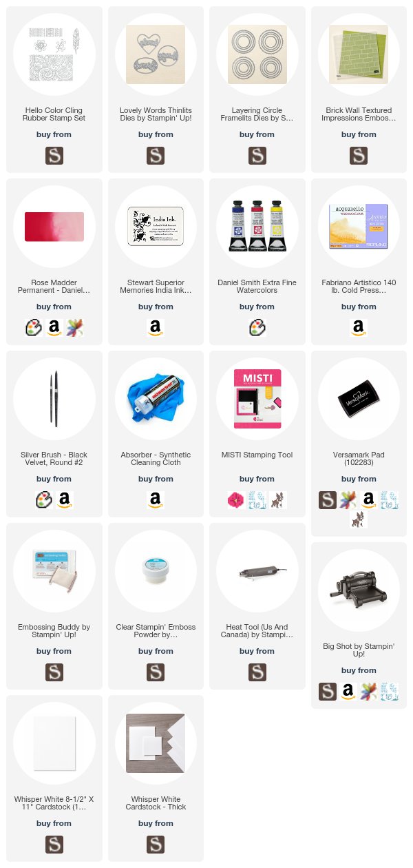
I really haven't made it all the way through the new catalog stamp sets yet, so I pulled out a really wow stamp set for this card. I heat embossed the image and then watercolored it with the colors linked below.
Emboss Resist Stampin Up by Understand Blue


See? And I didn't even die! It was dicey for a bit, not gonna lie, but I love this card.

I should start a support group - I could even invite the anti-glitter people. Those of us who don't like ribbon, etc. We could just hug it out - ss long as none of us have recently embossed, of course.

Now - about that die cut. When you see the Lovely Words dies in the catalog, they are cut out like mine are. In order to do that, you will need to get the Layering Circles Framelits, the Ovals and the Hearts - those products all coordinate with the Lovely Words dies. If you do not have those, then the dies will cut out everything you see - but what is outside of the circle on my card would just be cardstock, if that makes sense. The Layering Circles dies are what gives me just a piece I can use like I did here, not a word cut into a card front.

After I embossed that gorgeous image from Hello Color, I just watercolored the background. That's my favorite way to use embossing. You know - if I have to. :)

Behind that is cardstock embossed with the Brick Wall embossing folder, which looks good with anything.

I love having "hugs" cards around because they're good for any occasion.

So now, having written all that - I have to go wash my hands. I know you understand.

Check out today's Dare to Get Dirty challenges to see what challenge I made this card for and join us!

Loveyameanitbye.

Saturday, July 29, 2017

Feelin' Special?

Ohhh sometimes I crack myself up - just sitting here alone at my desk, doing diabolical things with stamps.

One of my favorite things to do in the WHOLE WORLD is to take sentiments that are supposed to be serious and use them with images in a way that completely twists their meaning.

Today, I did that with the help of a very inexpensive item, that happens to be my favorite thing in the world right now.
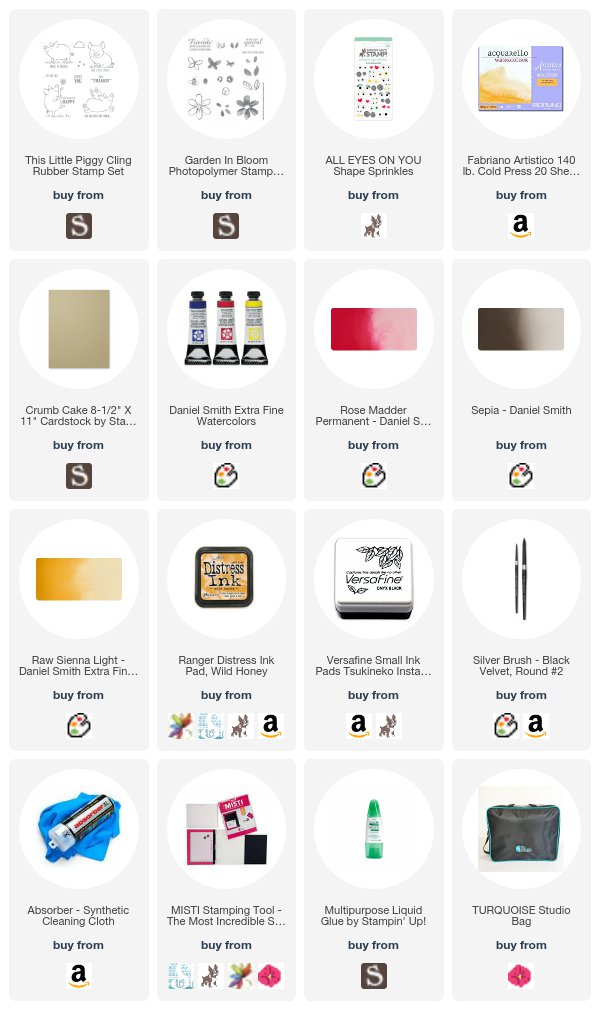
This Little Piggy by Understand Blue


Isn't that hilarious?? That really changes the tone of the sentiment, just those awesome eyes. I used two different sizes, just to make it even crazier. They are just self adhesive dimensional stickers and they are awesome.

I stamped the piggy image first in Wild Honey Distress ink, and then did some no-line watercolor of the image with my Daniel Smith watercolor. It's a large enough image that it's really fun to paint. The colors I used are in the link list above.

I cut all the sentiments in this set apart from the images so that it's more versatile, and can become quite twisted as I've shown here.

ICYMI - the MISTI studio bag is now for sale! It comes in three color schemes - MISTI pink, turquoise and grey. It's at a limited time price, so don't wait - it's a steal! I absolutely love mine - I took it to Santa Fe as my crafty bug-out bag and it rocked. Having a shoulder strap makes it extra awesome. Here's a video tour of the bag.

Don't forget to enter my big Arkon giveaway - there are still two days left to enter July's drawing.

Hope you're feeling SPECIAL like my little piggy.

Loveyameanitbye.

Friday, July 28, 2017

Things That Make Me Ridiculously Happy, Like Furniture for Food

I don't know if you heard about it, but the entire internet exploded earlier this month with one British man's rant on Twitter following his discovery that Americans don't use egg cups. Those quirky British! It was hysterically funny, and carried over to my friend Taheera's Facebook page, where the debate and confusion even escalated further between two groups of people who have great affection for one another, but still do not understand each other in the least.

During this heated discussion, I learned that British people do another truly hilarious thing, which I will describe and document below, because it makes me ridiculously happy.

I wanted to share my challenge sample for the first Dare to Get Dirty challenge tomorrow. It's my own challenge, and so of course I had to make it all about watercolor.

I just used water and reinkers to create an abstract background for this AWESOME, big bold sentiment from the Lovely Friends bundle.  I love these big sentiments, because background techniques are pretty much my favorite.
Let it Run Watercolor Technique by Understand Blue


Okay - so back to the Brits.

Aside from the egg thrones for their soft boiled eggs, they also have TOAST ORGANIZERS!!! They take breakfast SO SERIOUSLY that there is FURNITURE for all the food. We're just down here in Austin telling people to take everything on the stove and put it on a tortilla, which we fold in half and eat. No food furniture.

So this adorable toast organizer thingy is my new Ebay obsession since I heard about it in the great egg cup wars on Facebook. I laughed so hard at the IDEA of a toast display but then I realized something.

ENGLISH TOAST FURNITURE COULD MAKE BEAUTIFUL CARD ORGANIZERS.

Just like my beautiful vintage ashtrays make lovely brush rests for watercolor brushes. And like my vintage timecard racks make nice card storage.

So thanks to these strange people who will only eat organized toast, look at these lovelies.

Vintage Toast Racks as Card Holders by Understand Blue

Imagine how fancy your toast would feel in that thing. 

Vintage Toast Racks as Card Holders by Understand Blue

I especially love the modern circus one on the left. These hold cards from my friends and they make me smile every time I walk into my office.  

Vintage Toast Racks as Card Holders by Understand Blue

Here's a side view of one of the sturdier pieces of toast furniture - some are VERY tiny and would only hold like 3 Melba Toasts, but they're adorable - these are more appropriate for cards.

So just remember when you are cruising Ebay - strange things that people do in other countries can EASILY be incorporated into your cardmaking. :)

I hope all your breakfast foods are under control and not just rampaging around your tables all willy nilly like AMERICAN breakfast foods. Those ANIMALS! :)

Don't forget a few important things! There is a great special on the kit bundle right now with a lot of freebies! And if you join in July, on August 1st you can preorder from the holiday mini, which is AMAZING. Yes, the rumors are true. There IS a cat punch among other fantastic products :). The kit is absolutely no strings attached, and in July comes with a $72 additional freebie, so check that out here.

Also, there are three days left of my July Arkon giveaway - see the details here. And you always get 20% off at Arkon with code Understandblue.

And finally, the new host code is 4BY7YKR7 if you need to place an order! 

I hope you have an awesome weekend. 

Loveyameanitbye.

Monday, July 24, 2017

Seas the Day

I'm still plugging along with my World Watercolor Month challenge, and I did a fun one this weekend while working on Dare to Get Dirty samples.

It just so happened that one of the prompts coincided with one of the challenges for DTGD (which I still can't tell you about until Saturday :) so I made a card and did a page in my sketchbook for it.

One thing I hadn't done during the challenge yet was masking, so I got out my FAVORITE masking fluid (link also below photo). This stuff is amazing. I've tried all the others, and disliked them for one reason or another - too stinky, too sticky, wrong drying times. But THIS - this is my one true masking fluid. I have it in both white and blue. It's not expensive, and it has a really fine applicator which is perfect for masking. You can add a little or a lot and it stays wet long enough for you to work it where you need it to be and not get gummy and pilled.
Stampin' Up! So Many Shells  - Schmincke masking fluid, Daniel Smith Watercolor by Understand Blue


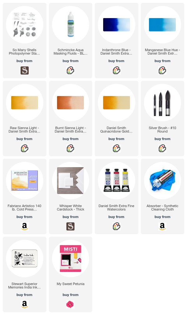
So what I did was apply the masking fluid in a diagonal line, making little dots and wiggles I thought would look like foam, and then some stripes out in the water area for whitecaps. You need to wait until the fluid is TOTALLY dry before you watercolor, and AFTER you watercolor, that needs to be TOTALLY dry before you remove it. This was unusually easy for me this time because I had 15 other cards I needed to get done on Saturday. I watercolored it with the blues and golds listed above, and lightly spattered the sand with Burnt Sienna for a tiny amount of speckle. Then I used my MISTI to stamp the sentiment from So Many Shells.

It was so simple and quick, and I love the look. This is an easily duplicatable card, and would work with ink refills as well as watercolor. You just have to learn to think and work backwards.

Here's the sketchbook page with the same process. I love how ephemeral watercolor is. You are NEVER going to be able to reproduce anything you do with watercolor.

Watercolor sketchbook  - Schmincke masking fluid, Daniel Smith Watercolor by Understand Blue


If you like watercolor, part of this challenge includes some great giveaways, so be sure and enter - you do NOT have to be playing along to be eligible to win!

Hannemuhle Watercolor Paper and Sketchbooks Giveaway
Davinci Watercolor Paint Giveaway

If you want to do any of the prompts, they are all on Charlie's site here. Which - I highly recommend subscribing to - his art is glorious, and his posts are so sweet.

And speaking of giveaways - don't FORGET - I have a huge monthly giveaway going - details on how you can win are at this post.

Happy Monday!

Loveyameanitbye.

Sunday, July 23, 2017

When Life Gives You Lemons, Paint Kitties


I saw one of those "he must have too much time on his hands" comments on Facebook the other day.

There are few things that make less sense than that sentence. I wrote a post about this three years ago, which you can read here. And it still floors me that people can't hear what it sounds like when they say that.

My brother-in-law stumbled across the sweetest story on Pinterest and shared it with me today, and I was just amazed. It's the story of Maud Lewis, a painter in Nova Scotia, who painted the entire interior and exterior of her teeny, one room ( 9' x 10') home during her very difficult, and literally painful life. Her paintings were just the opposite of her situation - bright, whimsical, sweet and cheerful. Her subject matter, like her home and life, were small and local.

I'm sure if there had been social media in her lifetime, some ding dong would have commented on one of her Instagram posts: "you must have too much time on your hands" after seeing the flowers she painted on her stove, on her walls, and on the outside of her house. Or her little childlike kitties she liked to paint. The kitties are my favorites.

Having just seen her work for the first time today, I can say she most definitely did not have enough time. Not nearly enough. She passed away in her sixties. There's a sweet little video about her here, and as a bonus there are some very fuzzy cows in it.

The human spirit is an amazing thing. I can't imagine living in a house the same size as my teeny studio, or painting and doing all the things she did while barely able to hold a paintbrush. I've always thought that whole tiny house thing was a recipe for a multiple homicide. But she made sweet kitties out of it.

If you want to read more about her, here are all the books about her, and here's the article he sent me.

She's my inspiration today, with a little help from Dare to Get Dirty and World Watercolor Month. She most definitely got some lemons, but still managed to live her life with zest.

Still Life with Stampin' Up! Lemon Zest and Schmincke Watercolor by Understand Blue


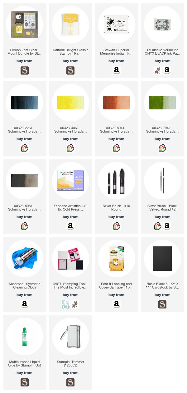
This is the second citrus I've painted for World Watercolor month, but this is the first time I've stamped for the prompts this month. I decided to turn the lemon image from Lemon Zest into a still life, because it's a nice, big image perfect for watercolor. I feel like making a ton of these - it was so fun and relaxing. I used a very limited palette, which is listed above, and the whole process took 19 minutes. I sped that up for you for a quick video. I edited out the 3,000 times I reached across my palette to rinse my brushes because it was annoying :) But other than that it's as it was. Someday I'll figure out where to put everything so that I'm not always reaching across the frame and I'll save a ton of editing time. But in the meantime, here it is.


I used Schmincke watercolor for this. It's been fun to see the difference between the Schmincke and the Daniel Smith paint. All watercolor lines are surprisingly different. I could have 40,000 Prussian Blues and it would still not be enough, I can tell you that.

The daily painting challenge from World Watercolor Month has not only given me a lot more working knowledge of the paint, but I've learned a ton of other skills as well. Amazing how much you can learn if you dedicate yourself to something daily for a month. I'm sure all our teachers told us that at some point and we ignored it until it became practical in our own lives.

Now I have some VERY exciting news for you guys. From now until the end of the year - I'll be giving away a HUGE prize from my friends at Arkon.

As you know, I LOVE my phone stand that I use to film my videos. There's a 20% off code in the footer of every blog post that you can use on their site any time. This thing is sturdy, takes up a small amount of space and is the only reason I can produce videos regularly. The before and after effect on my YouTube channel is remarkable. I'm a HUGE fan.

So every month from now until December, I'll be giving away a monthly prize package which includes my stand, plus the AWESOME ring light for the perfect selfie, perfect lighting for Facebook lives or desktop live video. These guys know what they're doing, and they're very generous - so you are the beneficiaries!

So starting today, and in the last week of every month for the rest of the year, you will have a chance to win this amazing giveaway. First - every one of my online customers will be automatically entered to win with a $25 or higher order in my store - you do not have to do anything at all extra to be entered! That begins today as a thank you to every one of my Stampin' Up! customers - I appreciate you! Orders between the 23rd of the month and the 22nd of the next month will count for that month.

For everyone else, simply leave me a comment here with the words "I want to win an Arkon Live Streaming Pro Phone Stand" somewhere in your comment. Be sure your Google Profile has an ability to contact you in it. I don't recommend leaving your email in the comments - spammers can grab that. Just fill out your profile and be sure it includes a link to your email.

I'd also love to hear what you think of sweet Maud Lewis and her ability to make lemonade.

Stay tuned for more sneak peeks of my Dare to Get Dirty cards in the coming days!

Loveyameanitbye.

Tuesday, July 18, 2017

Come Back, Chronological Order!

My sister posted an incendiary question on my Facebook page yesterday, and ignited the angst of all of us non-millennials who have been deprived of time by millennials.

Specifically, chronological order.

One of the the things I really love about forums is that the content is in chronological order. You can find old things, or find new things, but they are in the order they happened.

Then Facebook arrived, and the world became ordered by randomness, as if that were possible. Our definitions of yesterday and tomorrow were destroyed, as we began to see Monday's posts on Friday, and not see Friday's posts at all, let alone on Friday.

It's the feeling you get inside novels with non-linear time, like 100 Years of Solitude. Time just swirls all around you, and like you're a cow out in a field somewhere, it's just "today" and don't bother with the details.

When Instagram killed off chronological order, there was rioting. (And by that, I mean people typing rude, misspelled comments with poor grammar).

But the last front in this epic war is the order of books (and podcasts) in a series. A SERIES. That word means something! But not to Amazon. Not to the Apple Podcast app, or the internet in general. Any one of you whose brain has been damaged by the humiliating act of typing "what is the order of the Louise Penny books?" into Google - we stand with you. It's inhumane. Terroristic. We must rise up and restore time on this earth before no one cares anymore. I welcome you to fight alongside me. Sadly, I can't tell you what day or time to meet me because I can't tell any of those things, BUT WE WILL FIND EACH OTHER!

Anyway - back to my beloved, chronologically ordered forum happy place - Splitcoast. We are working behind the scenes on the most fun week of the year - the Dare to Get Dirty challenges.

This is a week of challenges by Dirty Dozen Design Team members and Alumni, just for Fan Club members who support the site with their membership dues. Fan Club members enjoy instant uploads to the gallery, a monthly private gallery created by the team, and exclusive tutorials and challenges. Our wonderful sponsors have lots of prizes for them at the end of the challenges, and it's a chatty, colorful week in the gallery.

There are more challenges than there are days, since we do multiple challenges per day, so I'm sneak peeking some of my cards. What the challenge is is a secret - but I can show you my sample for Dina's challenge!

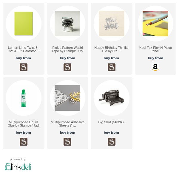
I wanted (like I do every day) to use Lemon Lime Twist cardstock with some lively black and white, so I used the new Pick a Pattern Washi Tape - this comes with five rolls in five different widths - I love the super skinny 1/8" tape - by just adhering stripes of it to cardstock. Then I die cut the Happy Birthday thinlit out of both the lime green cardstock and the taped cardstock and die cut inlaid them back together. I used a Kool Tak pencil I got in Santa Fe for a pick-up stick for the itty bitty bits. I love finding new pick up sticks. They're all a bit different. I think it makes for a fun, happy card!

Now on the white cardstock panel, I adhered a Sizzix Multipurpose adhesive sheet to the back after I die cut it, so that the openings where the greeting was was sticky and I could just piece in the die cut pieces easily. Then I glued the whole thing to the card base.

Very fun and a it's hiding a very clever challenge that will go up on the 29th!

Now for two bits of VERY exciting news! My Sweet Petunia is turning THREE YEARS OLD today!

I cannot believe how much the MISTI has changed the stamping world in three years. I still kick myself for not buying it as soon as I heard of it. I'm so grateful the MSP for all the cardstock I've saved, and how much better my stamping and no-line watercoloring is because of this amazing tool. So Happy Birthday to MISTI! To celebrate, she's have a birthday sale - no coupon needed! 20% off on the Original MISTI that was born 3 years ago, as well as grid paper and the grid mousepad. Go forth and shop here! Sale ends Friday!

And here are my two winners of the amazing Unicorn Awesomeness bundles! I've given them your names, so shoot an email to them here, and they will get your info! :)  Congratulations and thank you so much for all the comments!


LoveyameanitgogetadealontheMISTIbye.

Tuesday, July 11, 2017

Duoprinting, Part Two

Remember my Duoprinting with Chlorophyll tutorial?

Well today that tutorial is being featured on Splitcoaststampers today, and I added a little twist this time.

I made lots and lots of really beautiful prints from my garden, and then I added just tiny bits of shading with Daniel Smith watercolor and this STUNNING, tiny detailed paintbrush I bought in Santa Fe - it's like painting with a single hair plucked from the tail of a unicorn!  Or something like that. On this card I added just three colors - those and the brush are linked below. Initially, I just used the shadow violet, but then I thought some brighter notes would be nice. I really didn't add much - the duoprinting did all the heavy lifting. The brown areas on the stem are from the plant. I wrote the name with a super skinny Micron pen.
Chlorophyll printing by understandblue

This Estaceno chile is delicious - it's a New Mexico chile that my sister brought me seeds for when she visited Baker Seed in Missouri. That place is LITERALLY the mother ship of all seeds.

I also printed herbs like parsley, oregano, mint and even my Calamondin Orange. They're all so unique and fun.

Here's a print of my butterfly bush, which hasn't bloomed yet this year, but is a beautiful plant. Lightly accented with Shadow Violet.

Chlorophyll printing by understandblue

I used watercolor paper for these, and to me, the result is more detailed and crisp than when I used cardstock in the original tutorial. Some of them, like this one - look like photographs.

I can't believe how much the watercolor paper and a tiny bit of watercolor shading do for this technique! I'm enjoying the heck out of it. Hope I have some plants left by the time I move on to something else :)

I hope you check out the step by step photos in the tutorial and give this a try!

Loveyameanitbye.

Saturday, July 8, 2017

Non-Precious Art

I've been trying to work on "non-precious" art lately.

Last summer, I took Art Journal Summer School, and I think that was the origin of this for me. I had never really done any art journaling - I've always started projects with the idea, at least, of finishing them. Cardmaking does that to you - you really want to end up a card at the end of the effort. But art journaling can free you from that, letting you practice techniques, try color combinations and mediums, and even write some things down that you wouldn't write down anywhere else. It was quite liberating, especially the secret writing part.

Then, my friend Lori introduced me to the Close to Home watercolor class. In the first videos - I marveled at the beautiful paintings in Michelle's casual sketchbook, and I was still struggling with preciousness - thinking "HOW CAN SHE NOT FRAME THOSE??" But I kept watching. And her philosophy started to sink in. Practice is art. You are learning during practice sessions. You might love a practice piece, but you didn't go into it with a "precious" mindset. You went into it wanting to try something, with an equal shot at success and failure. And when you fail, you can just turn the page. Maybe after taking notes on what didn't work, which is what I like to do. It's just a sketchbook. It might end up being a pretty sketchbook, but it's just a sketchbook. It's not expensive paper, it's covered with notes, the outside might have paint all over it. It's humble.

After I took that class, I took a photo at the Wildflower Center (I showed it to you here), and Lori and Lisa Spangler and I used it as a challenge to each other. I brought my sketchbook to Ohio and got to sketch with Lisa, which was amazing. She has inspired me this year with her nearly daily sketching of plants and animals she sees on her trips to beautiful Texas Prairies. So now I'm officially hooked.

It's quite liberating. I highly recommend it, no matter what kind of art you're doing. Try stamping techniques or new products in a book. It's very fun to fill up the pages and look through them.

This month is World Watercolor Month, and so I'm doing more sketching than normal, which has been fun. I've asked people on Facebook if I can save certain photos to use as sketch inspiration, and I've loved painting the places both they and I have been recently.

I save the photos to a private Facebook album that only I can see (I recommend this also for times you are going on vacation but don't want the world to know your house is empty - just change the privacy of it when you get home!) and then I bring them up on my iPad so I can see them while I'm painting.

When I'm done, and if I like it - I print out the photo on this AMAZING portable printer I got - I read a million reviews and this one won - and I glue or tape the reference photo into the sketchbook - the little photos are the perfect size for this.

So I thought I'd just share a few recent ones I have done.

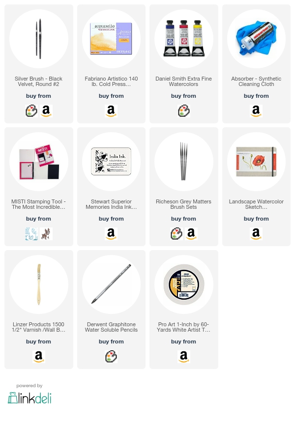
This is from a photo I took during my last retreat when a storm was rolling in - Temple, TX. It's not that great, but it let me practice clouds, which are hard, and use a brush Antonio Darden gave me when we visited his studio. I lightly sketch with a water soluble pencil (links to everything below) before I start painting each sketch, and sometimes, like here, I mask with tape.


This next one is from a photo my friend Meg took the other day at Lake Powell in Arizona - I ended up loving this one. The Hematite Burnt Scarlet watercolor is so much fun - it has a black granulation in it that makes it so perfect for rocks.
And speaking of Hematite Burnt Scarlet - it makes GLORIOUS bricks. This next page was very brave on my part - I've never tried a reflective surface before and it was definitely challenging. Also challenging was all the different perspective issues created by different planes of the walls around the barber pole. The World Watercolor Month prompt on July 4th, was red, white and blue, so this is what I came up with, with the help of this reference photo by Lisa Knechtel.

See the oopsie bottom right from some paint from a previous page? Doesn't matter - just a sketchbook. :)

This one was very challenging and fun and I ended up liking it a lot.

I got a tool in Santa Fe that blows my mind in the perspective department. I have lots of artist viewfinder tools, but none of them as genius as the View Frame by Miira. This ingenious magnetic guide system was invented by a woman and her son in Oklahoma. There's also a great app that goes with it. I purchased mine at Artisan and when I took my sister back to get one the next day, I noticed hers had a little pouch that mine was missing, and so I emailed the company and instantly got a kind, helpful response, so I'm a fan! It looks like she has a newer version in the works that's in pre-order right now, so check out her website! The original one is on sale with free shipping to make room for View Frame II, so you might want to snag one.

The AMAZING new brushes I got in Santa Fe are just phenomenal. They are synthetic, which I have never liked before these, but they are SOOOOOOOO tiny and perfect for detail work. All you Breaking Bad fans will understand why I love their name too - Grey Matters.

You can do teeny lines and details with them, and I love teeny details.

People have asked me to film these sketches - but there are a few reasons I don't. The most important one is that it would instantly make it "precious", and that's what I'm trying to get away from with my books. I'm just in a learning phase, and I need the safety of a practice sketch to be just that. When I ACTUALLY am technically proficient and can produce repeatable success, maybe. But also - these take me hours over days - and I walk away a lot. It doesn't lend itself to the storage capacity of my current iPhone.

Make lots and lots of non-precious practice art. Enjoy the process and view the result ONLY as knowledge, and you'll have so much fun, I promise. Hope you're having a great weekend!

Loveyameanitbye.

Friday, July 7, 2017

Remember Griffin and Sabine?

I think I discovered Nick Bantock in college or shortly after, which was many moons ago.

I LOVED Griffin and Sabine, with all the beautiful envelopes and artifacts tucked into the books, the mail art, and the strange and mysterious story of their correspondence. After I read the books, I bought the Nick Bantock rubber stamps, and used to actually create mail art that was MUCH better than what I was doing in the way of cardmaking back then!

But then, as my cardmaking got better, my envelopes got more and more boring, and now they're just plain white envelopes with terrible handwriting on them. That has to stop. I'm hereby issuing myself (and you if you like) to STOP sending completely boring envelopes.

In my defense, I do handmake a lot of envelopes out of retired DSP, but that's not really the same as the mail art of days of old. My friend Gary - and the best penpal in my life, really - used to do amazing mail art. Stamps and collage and drawing.

I remember Rubber Stamp Madness' mail art features and the ones in the Stampington magazines. I am going to get back to that level of awesomeness if it kills me. I STINK at hand lettering, which you will see soon. Like in just a few seconds. :)

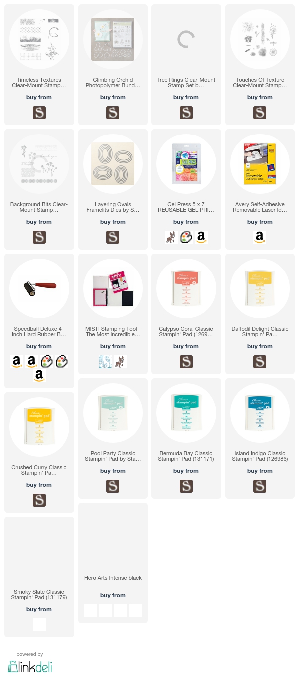
But I came up with a technique to at LEAST create pretty labels for my envelopes that are 100% handmade, and I hope you like it. First - enjoy what I did with half of the label paper that I used on a matching card - it's the background for the beautiful climbing orchid.
Climbing Orchid card with ink layered background by Understandblue
When I do this technique, I can cut each sheet in half - half of the sheet makes TWO pretty envelope labels, because I die cut an oval out of the center of half the sheet and can use both the oval and the frame for envelopes as you can see here.


Ink layered gel press labels by understandblue
Here's a closeup of what the frame label looks like.

Ink layered gel press labels by understandblue

Here's card #2 where I used half the label paper for a different background.
Climbing Orchid card with ink layered background by Understandblue
Here's what the label looks like that matches that card.
Ink layered gel press labels by understandblue


Now how did I do that, you ask?

Well let me show you! I'm a contributing artist over at Gel Press today, and so I made a video of this fun technique using just ink, a Gel Press, your MISTI and some label paper. You will get addicted, I promise. In 10 minutes you will throw down your mouse and run for your desk. Promise.


So send some PRETTY mail today, won't you? These two are already in the mail and I plan to make lots more over the weekend.

I'll be back soon with something completely different.

Loveyameanitbye.
Related Posts Plugin for WordPress, Blogger...