Pages

Wednesday, May 22, 2024

VIDEO: Easy Mixed Media With Newspaper


*Compensated affiliate links may be used at no additional cost to you. No posts here are sponsored or paid.*


I have several journals from this incredible artist and one of my original Twitter friends from 2009 - Renate. You'll see one of them in today's video. They are all hand painted and the paper is hand torn - they are beautiful.

Each one comes very carefully packaged and she wraps them in this newspaper that is much higher quality than American newspaper - the ink doesn't smear, the paper is thicker and has a rosy tone. 

I absolutely cannot throw it away, so today I'm making it into cards. 

My inspiration for the sentiment design is these stunning 3D butterfly stickers. I used mostly the black and white, but also the pink, and there are gorgeous purple and blue sets. To mirror these, I used holographic cardstock with this triple layered die. This die has sentiments that you cut out all at once and the die is super sturdy, with thick metal so it doesn't warp going through the machine. 

For the newsprint background, I first used a glue stick to adhere the paper to cardstock. Most glue sticks are absolutely terrible. If you watched my pandemic lives you know that I tested every glue stick available in the US in 2021, and there's only one that actually works. I'm stunned that people continue to use and promote some of the more common office supply store brands.

Then I put a thin layer of chalky gesso on it so you could still see the print - but I wanted to tone down the rosy color a bit to match my butterfly. I added splatters and marks with a thick black acrylic marker.


Since I had more newspaper and more butterflies - I made more cards!
I even have one piece leftover that will be a tag.


Without further ado - here's the video in which you will also see the journal!


Loveyameanitbye.

CURRENT COUPON CODES
10% off stamps, stencils and dies at TRHD here with UNDERSTANDBLUE
20% off anything at Glassboard Studio  - UNDERSTANDBLUE.
10% off the whole store at A Colorful Life Designs - LydiaFan10
Arkon Mounts -  - 20% off sitewide with code UNDERSTANDBLUE

Monday, May 6, 2024

Happy Birthday To Us! + Giveaway


*Compensated affiliate links may be used at no additional cost to you. No posts here are sponsored or paid.*

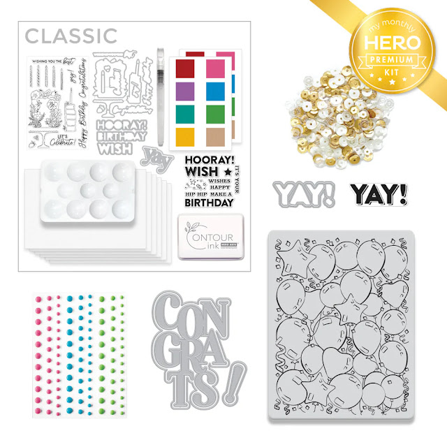
It's here!!! Hero kit day and I could not be more excited about it! I love a good birthday theme / all year kit and this one is so cute. 

I had a TON of fun with the add-ons too - especially this bubble background stamp which you'll see in a video soon - but look closely at the little builder greetings in this set - I have some fun ideas for that. 


Check out the kit though... That balloon stamp is so fun to color!! 


Now you can see where I got the shaker mix & cake for this card:


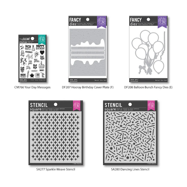
The addons are beautiful:


Here's the bubble stamp! I'll be using the dies above with this - FUN combo.


Want to see more inspiration & be entered to win the giveaway? Head over HERE for a list of everyone in the hop!


CURRENT COUPON CODES
10% off stamps, stencils and dies at TRHD here with UNDERSTANDBLUE

20% off anything at 
Glassboard Studio  - UNDERSTANDBLUE.
10% off the whole store at A Colorful Life Designs - LydiaFan10
Arkon Mounts -  - 20% off sitewide with code UNDERSTANDBLUE

Complementary Colors - A Different Way


*Compensated affiliate links may be used at no additional cost to you. No posts here are sponsored or paid.*

I have talked about complementary colors a lot over the years - mostly because I think it's the one thing you can use to really make your coloring in any medium really pop. 

But you don't have to do direct complementaries - you can sort of come at them from an angle and it's still very effective. I made a card today to show you want I mean and how it works. 

I'm using a little mermaid image for this with two distinct parts - the mermaid and the shell. To keep it simple, I used four colors (except for the skin tones). The four colors are Cerise, Prawn, Nile Blue and Veronese Green. You can see that the green is used to shade the blue. So instead of choosing orange as a complementary to the blue, I chose a warm red. So the complementary relationship isn't a direct complementary - it's more subtle. The green that I used for shading is also almost a direct complementary to this same red though, so using it to shade the non-direct complementary increases the contrast overall. Same with the hot pink - that is nearly a direct complementary to the green as well - but when you look at this image overall, the overwhelming feeling you get is that it's a blue image, right? That's because the shading color is adjacent to blue on the color wheel.

So all that to say you don't have to always go straight across the color wheel to get a pop of contrast - you can wiggle around a bit! I used the matching dies to cut her out and put her on my fave 300 gsm kraft cardstock


I'm part of a blog hop today with this sweet little mermaid. To see more inspiration - check out the list below!

I'll be back today at noon - don't forget! Loveyameanitbye.

CURRENT COUPON CODES
10% off stamps, stencils and dies at TRHD here with UNDERSTANDBLUE
20% off anything at Glassboard Studio  - UNDERSTANDBLUE.
10% off the whole store at A Colorful Life Designs - LydiaFan10
Arkon Mounts -  - 20% off sitewide with code UNDERSTANDBLUE

Saturday, May 4, 2024

Strawberry Cake Nostalgia - Hero Arts Sneak Kit Peek!


*Compensated affiliate links may be used at no additional cost to you. No posts here are sponsored or paid.*

There was a HUGE debate a few months ago online about yellow cake vs. other cakes, and I was surprised at how strong people's feelings were about this topic! It got quite heated. 

I'm not generally a cake person - pumpkin pie is my jam - but the whole debate jolted loose a memory for me of a cake my childhood friend's mom made once - it was Duncan Hines I think - some mix - but it was literally the first pink cake I ever saw in my life and I was enchanted. It was strawberry, I think. 

She made it with chocolate frosting, because no matter the cake, he loved chocolate frosting. The cake was a delight and my inspiration today with the new Hero Arts kit - a birthday theme

I decided to go a little vintage with the main image and do no-line watercolor over a shaker - the sequins are included in the kit. HINT - the liquid watercolor I used is a little Easter egg for what's in the kit, but of course I'm sworn to secrecy. So come back on Monday.


Head over to the Hero Blog today for more peeks and enjoy your weekend - even if you like yellow cake! 


CURRENT COUPON CODES
10% off stamps, stencils and dies at TRHD here with UNDERSTANDBLUE
20% off anything at Glassboard Studio  - UNDERSTANDBLUE.
10% off the whole store at A Colorful Life Designs - LydiaFan10
Arkon Mounts -  - 20% off sitewide with code UNDERSTANDBLUE

Friday, May 3, 2024

Tropical Vibes From Our Rainy Season...


*Compensated affiliate links may be used at no additional cost to you. No posts here are sponsored or paid.*

It will NOT stop raining!! I just want to weed my flowerbeds and it's too nasty out. This morning I got up and my poor little wet squirrels were all waiting for me like in a cafeteria line poor critters. One of them is Monkey's baby - she is Clarence's tiniest baby - and he is even tinier so he's just learning to forage and it's hard with all these storms. He's figured out pretty quickly that I mean food though so he'll be okay until the sun comes up. 

So I thought I'd just roll with it and do a tropical theme today. 

I did my Blackout Embossing technique with a dark grey ink pad over these embossed leaves - it looks very dark and jungly, so I made my little birds brighter with OLO markers. I felt like if I didn't leave the branch white it would get lost on that darker background and I like the way that turned out! The sentiment is from this set.


I used the same set from the sentiment to make a brighter, cleaner bird card with this embossing folder that I know is impossible to really see and I'm sorry! 😂


For the last card, I decided to make it in a Peter Max style - I used to have these awesome Peter Max coloring books as a kid I've referenced a few times, and that is what the style of this image reminded me of and the stencil just brought it home. The stencil is a layering one - so on the second one I just made the same ink darker.

A little white gel pen did the trick!

After I die cut it, I colored the white edges black for a little extra pop.


What are your weekend plans? I have to do indoorsy stuff I guess! There's always a closet to purge, right?

I've said this on Facebook, but not here - you HAVE to watch Will Trent. 

Loveyameanitbye.

CURRENT COUPON CODES
10% off stamps, stencils and dies at TRHD here with UNDERSTANDBLUE
20% off anything at Glassboard Studio  - UNDERSTANDBLUE.
10% off the whole store at A Colorful Life Designs - LydiaFan10
Arkon Mounts -  - 20% off sitewide with code UNDERSTANDBLUE